Analyzing Algorand Blockchain Data with Databricks Delta
by Anindita Mahapatra and Eric Gieseke
Get an early preview of O'Reilly's new ebook for the step-by-step guidance you need to start using Delta Lake.
Algorand is a public, decentralized blockchain system that uses a proof of stake consensus protocol. It is fast and energy-efficient, with a transaction commit time under 5 seconds and throughput of one thousand transactions per second. The Algorand system is composed of a network of distributed nodes that work collaboratively to process transactions and add blocks to its distributed ledger.
The following diagram illustrates how blocks containing transactions link together to form the blockchain.
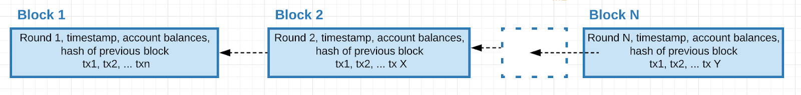
Figure 1: Blocks linked sequentially in Algorand Blockchain
To ensure optimum network performance, it is important to continually monitor and analyze business and operational metrics.
Databricks provides a Unified Data Analytics Platform for massive-scale data engineering and collaborative data science on multi-cloud infrastructure. Delta is an open-source storage layer from Databricks that brings reliability and performance for big data processing. This blog post will demonstrate how Delta facilitates real-time data ingestion, transformation, and visualization of the blockchain data to provide the necessary insights.
In this article, we will show how to use Databricks to analyze the operational aspects of the Algorand network. This will include ingestion, transformation, and visualization of Algorand network data to answer questions like:
- To ensure optimum network health, is the ratio of nodes to relays similar across different regions?
- Are the average incoming/outgoing connections by host by country within a reasonable threshold to ensure good utilization of the network without straining specific hosts/regions?
- Do average connection durations between nodes fall below a certain threshold that might indicate high rates of connection failures or a more persistent problem?
- Are there any potential weak links in the network topology for global reach/access?
- Given a node, what are the other nodes that it is connected to, and how does that change over time?
- Having different methods of visualizing the data facilitates detecting and addressing issues.
This is the first of a 2 part blog. In part 2, we’ll analyze block, transaction, and account data.
Algorand Network
The Algorand blockchain is a decentralized network of nodes and relays geographically distributed and connected by the Internet. The nodes and relays follow the consensus protocol to agree on the next block of the blockchain. The proof of stake consensus protocol is fast and new blocks are produced in less than 5 seconds. In order to produce a block, 77.5% of the stake must agree on the block. All nodes have a copy of the ledger, which is the collection of all blocks produced to date. There is a significant amount of communication between the nodes and relays so good connectivity is essential for proper operation.
The Algorand network is composed of:
- Node: An instance of Algorand software that is primarily responsible for participating in the consensus protocol. Nodes communicate with other Nodes through Relays. Because it is a distributed ledger, each node has its own copy of the transaction details.
- Relay: An instance of the Algorand software that provides a communication hub for the Nodes
- Nodes and relays form a star topology where
- A node can connect only to one or more relays.
- A relay can connect to other relays
- The connections between nodes and relays are periodically updated to favor the best performing connections by disconnecting from slow connections.
Node Telemetry Data
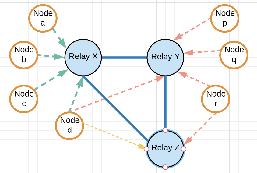 Figure 2: Nodes and Relays in an Algorand Blockchain Networks |
Note: The data used is from the Algorant mainnet blockchain. The node identities (IP and names) have been obfuscated in the notebook. |
Algorand Data
| # | Data Type | What | Why | Where |
| 1 | Node Telemetry Data
(JSON data from Elasticsearch) |
Peer connection data that describes the network topology of nodes and relays. | It gives a real-time view of the active nodes & relays and their interconnectivity. It is important to ensure that the network is not partitioned, there is an equal distribution of nodes across the world and there is a balanced load shared across them. | The nodes (compute instances) periodically transmit this information to a configured Elastic Search Endpoint and the analytic system ingests from ES. |
| 2 | Block, Transaction, Account Data
(JSON/CSV data from S3) |
Transaction data and individual account balances are committed into blocks chained sequentially. | This gives visibility into usage of the blockchain network and people(accounts) transacting on it where each account is an established identity and each tx/block has a unique identifier. | This data is generated on individual nodes comprising the blockchain network that is pushed into S3 and ingested by the analytic system. |
Table1: Algorand data types
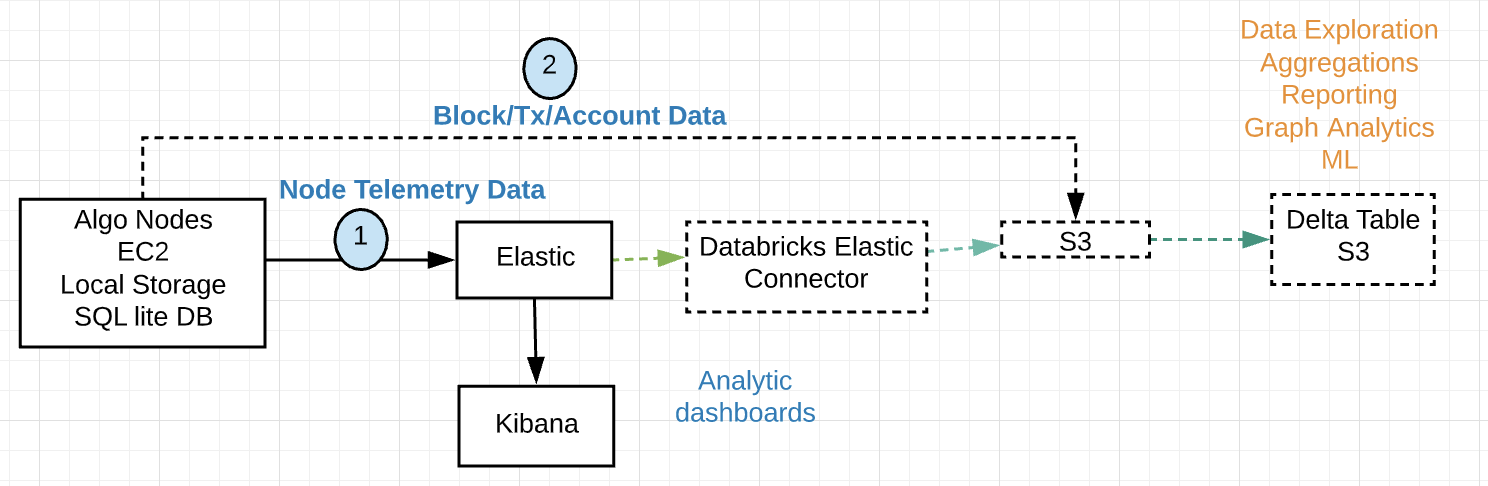
Analytics Workflow
The following diagram illustrates the present data flow.wp-caption: Figure 3: Algorand Analytics Primary Components
The ability to stream data into Delta tables as it arrives supports near real-time analysis of the network. The data is received in JSON format with the following schema:
- Timestamp
- Host
- MessageType
- Data
- List of OutgoingPeers
- Address, ConnectionDuration, Endpoint, HostName
- List of IncomingPeers
- Address, ConnectionDuration, Endpoint, HostName
- List of OutgoingPeers
Algorand nodes and relays send telemetry data updates to an Elasticsearch cluster once per hour. Elastic is based on Lucene and is primarily a search technology, with analytics layered on top of it and Kibana to offer a real-time dashboard with time-series functionality out of the box. However, the data ingested is in a proprietary format and there is no separation of compute and storage and over time this can get expensive and require substantial effort to maintain. Elasticsearch does not provide support for transactions and limited data manipulation processing options. The syntax to use queries requires some learning curve and for any advanced ML, data has to be pulled out.
To support analysis using Databricks, the data is pulled from Elasticsearch using the Elastic Connector and stored in S3. The data is then transformed into Delta Tables which support the full range of CRUD operations with ACID compliance. S3 is used as the data storage layer and is scalable, reliable, and affordable. Only when compute is required, a spark cluster is spun up. BI Reporting, Interactive Queries for EDA (Exploratory Data Analysis), and ML workloads can all work off the data in S3 using a variety of tools, frameworks, and familiar languages including SQL, R, Python, and Scala. BI reporting tools like Tableau can directly tap into the data in Delta. For very specific BI Reporting needs, some datasets can be pushed to other systems including a Data Warehouse or an Elasticsearch cluster.
It is worth noting that the present data flow can be simplified by writing the telemetry data directly into S3 to provide a consolidated data lake, skipping Elasticsearch altogether. The existing analytics currently done in Elasticsearch can be transferred to Databricks.
Blockchain Network Analysis Process
The following steps define the process to retrieve and transform the data into the resulting Delta table.
- Periodically retrieve telemetry data from Elasticsearch
- Parse & flatten the JSON data and save the incoming & outgoing peer connection details in separate tables.
- Call geocoding APIs for new node IPs
- Convert IP addresses to ISO3 country code and lat/long coordinates
- Convert from ISO3 to ISO2 country codes
- Analyze the node telemetry data for trends and outliers
- Using SQL
- Using Graph libraries
- Visualize Node Network Data
The following diagram illustrates the analysis process:
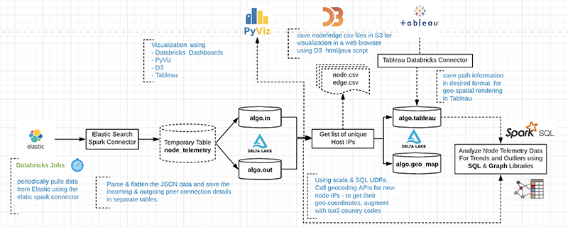
Figure 4: Algorand Analytics Data Flow
Step 1: Pull data from Elasticsearch
Use SQL to periodically read from ElasticSearch Connector to pull the telemetry data from Elasticsearch into S3. Data can be indexed and queried from Spark SQL transparently as Elasticsearch is a native source for Spark SQL. The connector pushes down the operations directly to the source, where the data is efficiently filtered out so that only the required data is streamed back to Spark. This significantly increases the query performance and minimizes the CPU, memory, and I/O on both Spark and Elasticsearch clusters as only the needed data is returned.
- Use the Databricks Jobs API to schedule the pull
- Use Secrets API to store sensitive credential information
Step 2: Parse and flatten JSON data
Create 'out' and 'in' tables to hold peer connection data received over the last hour. Use the SparkSQL explode function to create a row for each connection.
Step 3a: Create Edge information and save in S3 as CSV file
Step 3b: Create Node information and add geocoding
Create node information and save it in S3. Call geocoding REST API (e.g., IPStack, Google Geocoding API) within a UDF to map the Node’s IP addresses to its location (latitude, longitude, Country, State, City, Zip, etc). For each node, convert from ISO3 to ISO2 country codes. Add a column to indicate the node type (Relay or Node). This is determined based on the number of incoming connections, where only relays have incoming connections.
Table 2: Geo Augmented Data for each node
Step 4a: Analyze node telemetry data using SQL and charting
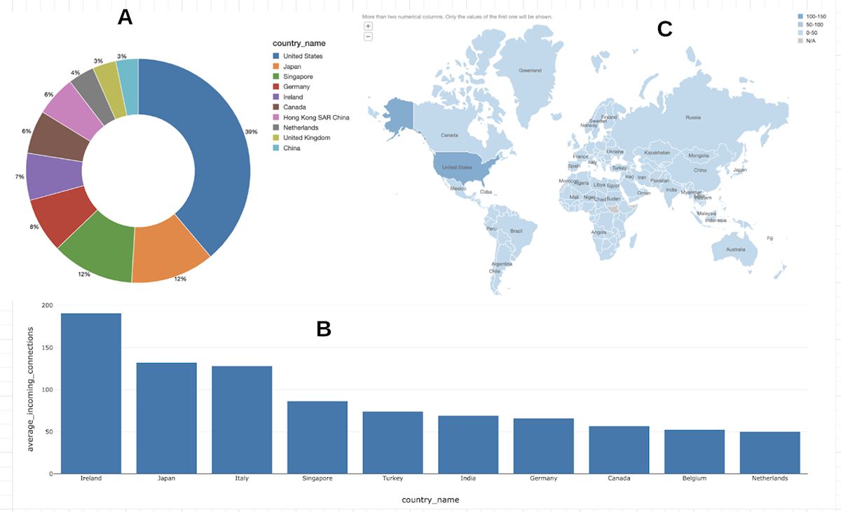
Figure 5: Node Analysis using SQL
(A) shows the percentages of nodes and relays for top 10 countries. The data shows that there is a higher concentration of nodes and relays in the US. Over time, as the Algorand network grows, it should become more equally distributed across the world as is desirable in a decentralized blockchain.
(B) shows the load distribution (Top 10 countries with highest Avg number of incoming connections per relay node) The incoming connection distribution looks fairly balanced except for the region around Ireland, Japan and Italy which are under higher load.
(C) shows the Heat map of nodes. The geographic distribution shows higher deployments in the Americas, as the Algorand network grows, the distribution of nodes should cover more of the world.
Step 4b: Analyze node telemetry data using Graph Libraries.
A Graph Frame is created out of node and edge information and provides high-level APIs for DataFrame based graph data manipulation. It is a successor to GraphX and encompasses all the functionality with the added convenience of seamlessly leveraging the same underlying data frame.
Detect potential weak links in the network topology using the Connected Components algorithm. Connected component membership returns a graph with each vertex assigned a component ID.
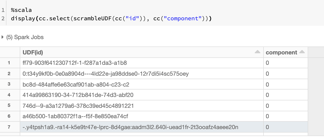
Each node belongs to the same component indicating that there are currently no partitions or breaks. This is evident when we select distinct on the components generated and it returns just 1 value - in this case, component 0.
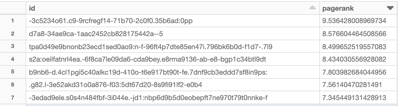
Analyze network load using the PageRank algorithm
PageRank measures the importance of each relay and is measured by the number of incoming connections. The resulting table identifies the most important relays in the network. GraphX comes with static and dynamic implementations of PageRank, here we are using the static one with 10 iterations, the dynamic PageRank will run until the ranks converge.
Step 5: Visualization of the geographic distribution of nodes and relays
It is important to understand the entire network which needs to be monitored for global reach/access to ensure the decentralized nature of the blockchain. The map is interactive and allows zooming into specific regions for more details. For example, in Tableau which has rich geospatial integration, the search feature could be handy.
Step 5a: Pyvis visualization of the star topology
The pyvis library is intended for a quick generation of visual network graphs with minimal python code. It is especially handy for interactive network visualizations. There are many connections between nodes and relays and visualizing the data as a directed graph helps to understand the structure. Apart from source/destination information, there are additional properties such as the number of connections between two nodes, and the node type.
The red vertices denote relays, the blue ones are nodes. Yellow edges represent connections between relays and the blue edges represent connections originating from nodes. The number of connected edges determines the size of vertices which is why the relays (in red) are generally bigger because they typically have more connections than the nodes. This results in a star topology that we see below.
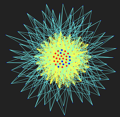
Figure 6: Pyvis visualization of Algorand Blockchain Network of nodes (blue) and relays (red), edges between relays are yellow and those with nodes are blue
From the diagram, you can see that most nodes connect to 4 relays. Relays have more connections than nodes and act as a communication mesh to quickly distribute messages between the nodes.
Step 5b: Geospatial Visualization of Node and Edge data in Delta using Tableau
Geospatial data from the Delta tables can be natively overlaid in Tableau to visualize the network on a world map. One convenient way to visualize the data in Tableau is to use a spider map which is an origin-destination path map.
This requires the Delta table to be in a schema like this.

The schema requires two rows for each path - one using the origin as the location, and the other using the destination as the location. This is crucial to enable Tableau to draw the paths correctly.
Where location refers to the node, path_ID is the concatenation of src & destination nodes along with latitude, longitude, and relay information.
To connect this table to Tableau, follow the instructions located here: notes to connect Tableau to Delta table. Periodic refreshes of the data will be reflected in the Tableau dashboard.
Tableau recognizes the latitude and longitude coordinates to distribute the nodes on the world map.
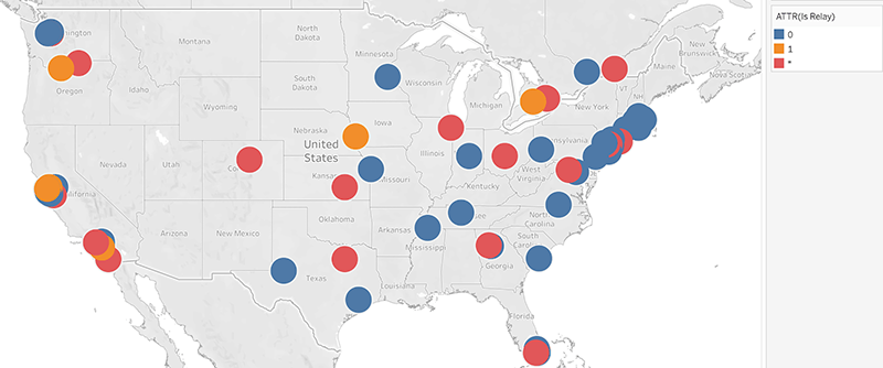
Figure 7: Tableau geospatial display of Algorand nodes and relays across the US
The map view makes it easy to visualize the geographical distribution of nodes and relays.
Add the path qualifier to show the edges connecting the nodes and relays.
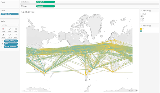
Figure 8: Tableau geospatial display of Algorand network paths
With the connections enabled, the highly connected nature of the Algorand network becomes clear. The orange connections are between relays and the blue ones connect nodes to relays.
Step 5c: Visualization of Node and Edge data in D3
D3 (Data-Driven Documents) is an open-source JavaScript library for producing dynamic, interactive data visualizations that can be rendered in web browsers. It combines map and graph visualizations in a single display using a data-driven approach to DOM manipulation. In the previous section, we saw how an external tool like Tableau could access the data, D3 can be run from within a Databricks notebook as well as a standalone external script. Manipulating and presenting geographic data can be very tricky, but D3.js makes it simple using the following steps.
- Draw a world map based on the data stored in a JSON-compatible data format.
- Define the size of the map and the geographic projection to use
- Use spherical Mercator projection to map the 3-dimensional spherical Earth onto 2-dimensional surfaces(d3.geo.mercator)
- Define an SVG element and append it to the DOM
- Load the map data using JSON (data formatted in JSON format namely topojson)
- Map styling is done via CSS
The following diagram demonstrates map projections, TopoJSON, Voronoi diagrams, force-directed layouts, and edge bundling based on this example. Updated node and edge data in Delta can be used to periodically refresh an HTML dashboard similar to the one below.
Figure 9: Algorand relays (orange) and nodes (blue) in US reporting their connection links
In this post, we have shown how Databricks is a versatile platform for analyzing the operational data (node telemetry) from the Algorand blockchain. Spark’s distributed compute architecture along with Delta provides a scalable cloud infrastructure to perform exploratory analysis using SQL, Python, Scala & R to analyze structured, semi-structured, and unstructured data. Graph algorithms can be applied with very few lines of code to analyze node importance and component connectedness. Different visualization libraries and tools help inspect the network state. In the next post, we will show how block, transaction, and account information can be analyzed in real-time using Databricks. To get started, view the Delta Architecture Webinar. To learn more about Algorand Blockchain, please visit Algorand.
Get the latest posts in your inbox
Subscribe to our blog and get the latest posts delivered to your inbox.