Find what you seek with the new navigation UI
Previewing a new navigation

We are excited to announce that we will be releasing a new UI that will make it easier for you to navigate Databricks.
Customers want a simpler navigation
At Databricks, we are customer obsessed—it's part of our culture. Customers are at the center of everything we do, so we take feedback from our users seriously. One piece of feedback that we've heard is that users want an improved navigation experience in Databricks. Over the past few months, we've spent time with many of you to learn more about problems you're facing and what an improved navigation experience would look like.
Users want fewer clicks for each task
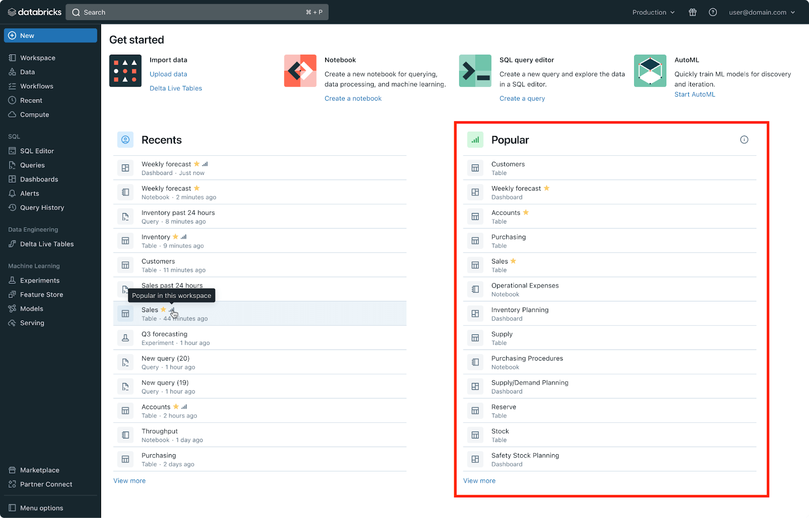
In our conversations, we noticed that there were two main themes around improving navigation. The first was that you wanted it to be easier to get from point A to point B in your workspace. Sometimes it takes you more clicks than you would like to get to your end destination; this can be time consuming if you're an advanced user and unintuitive if you're a new user. So we unified search at the top, and redesigned the Get Started section for the most commonly used tasks.

Your compact guide to modern analytics

Users want to discover new capabilities
The second theme was that you wanted it to be easier to know what was available in your Lakehouse. Many of you mentioned that you're impressed by the comprehensive suite of products we have for your Data and AI needs, but it's not always easy to know that we have certain features.
With these themes in mind, we were able to workshop a few different designs with customers and understand how well different options solved the problems outlined above. We are now in the midst of wrapping up a pilot of the new UI for Databricks and the feedback during this stage has again helped us build a stronger product. To make discovery easier, we added a section of popular assets. User feedback is important to us during every step of the product development process, so we're grateful for these customers that partnered with us.

See everything in a single navigation bar
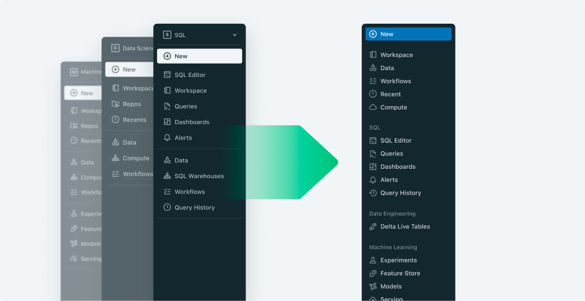
As you can see below, the new UI will remove the product area switcher in the top left and instead show all product areas in a single, unified navigation bar. At the top of the navigation bar, users will have access to the common pillars of the Lakehouse—Workspace Browser, Data, Workflows, Recents, and Compute. Underneath are the main product areas—SQL, Data Engineering, and Machine Learning—that are expandable and collapsible so you can focus on the product areas your current task requires.

Try the new UI yourself
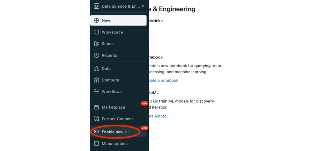
This will be a large UI change in terms of both the navigation improvements it's going to provide and the scope of Databricks users it will touch. As with any large UI change, it's important for us to give you an opportunity to try it out and provide feedback, so that we can ensure that we provide you with the best experience before we make it the default experience for all users. With that said, starting soon, all users will be able to try out the new UI by clicking the "Enable New UI" button in the bottom left of the navigation bar.

The new UI will eventually be the default experience for all users in Databricks, but it will remain default off while we receive and address feedback. Keep an eye out for in-product and email notifications for when we are ready to move to the next phase.