The Improved Databricks Navigation is Enabled for Everyone

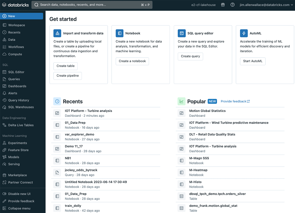
Starting today, all users will experience a new and improved navigation experience when using the Databricks UI. The changes will impact three surfaces: the home page, the sidebar, and search functionality.
Navigating Databricks just got simpler
We’ve heard from our users and it’s clear - you want to accomplish tasks with fewer clicks and you want to discover new capabilities within Databricks. While the current UI offers many capabilities that users are looking for, the improved UI makes it easier and faster to find what you need.
“Databricks enables us to accomplish even the most complex tasks. Being able to see all the different components in the improved navigation and use them right away increases our efficiency every day.” — Philipp Cueppers, Team Lead Energy Markets and Asset Optimisation at Vattenfall
A single home page for your most common tasks
The tiles on the home page have been streamlined to facilitate the most common tasks that we see our customers doing in Databricks. The home page is now a single page for everyone that streamlines access to what users need to resume their journey. We improved the Recents section and added Popular to discover the most used data assets within your organization to accomplish the task at hand. We also simplified the tiles at the top of the page to make it easy to do what you want - whether it's ingesting data, creating a notebook, modifying a query, or training an ML model. The improved home page unifies the previously separate home pages for Data Science & Engineering, SQL, and Machine Learning.

See more in the new sidebar
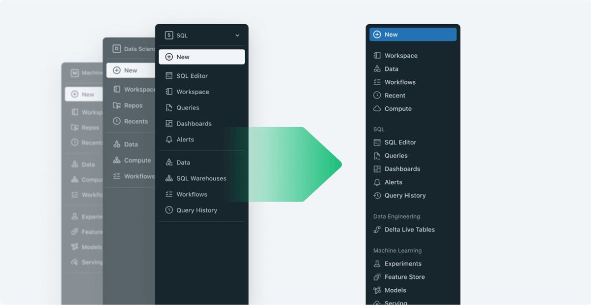
To reduce clicks and make features easier to find, we redesigned the sidebar. You no longer need to select a persona before being able to use features for that view. Universal resources such as Workspaces and Compute are at the top. Each domain has been pinned in the sidebar so that if a user needs to quickly switch from a dashboard to an experiment, they will be able to do so without having to switch personas.

Global search for all your workspace objects
The search bar now looks for all of your objects. Global search allows you to search for notebooks, tables, dashboards, and more from a single, always-accessible location. You're also able to see contextual metadata and apply filters to narrow down the results. You can either go directly into your assets like dashboards and experiments through the search bar, or you can navigate through the sidebar and go to your assets there.
We would love your feedback
As of today, everyone using the Databricks UI will have this improved experience. Should you have a reason to switch back to the previous navigation experience, you can opt out by selecting “Disable new UI” from the bottom of the sidebar and leave us feedback using this link. We are collecting feedback from users about the experience and will continue to make improvements.
We will keep the option to opt-out for a short period while we respond to customer feedback. After that, we will make the feature generally available and there will no longer be an option to opt out. All users will be transitioned to this new navigation experience so that we can keep the navigation experience consistent and documentation simple.
Never miss a Databricks post
Sign up
What's next?

Product
November 21, 2024/3 min read
