Apache Spark™ Tutorial: Getting Started with Apache Spark on Databricks
Overview
As organizations create more diverse and more user-focused data products and services, there is a growing need for machine learning, which can be used to develop personalizations, recommendations, and predictive insights. The Apache Spark machine learning library (MLlib) allows data scientists to focus on their data problems and models instead of solving the complexities surrounding distributed data (such as infrastructure, configurations, and so on).
In this tutorial module, you will learn how to:
- Load sample data
- Prepare and visualize data for ML algorithms
- Run a linear regression model
- Evaluation a linear regression model
- Visualize a linear regression model
We also provide a sample notebook that you can import to access and run all of the code examples included in the module.
Load sample data
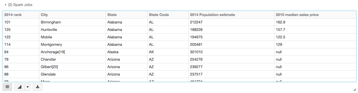
The easiest way to start working with machine learning is to use an example Databricks dataset available in the /databricks-datasetsfolder accessible within the Databricks workspace. For example, to access the file that compares city population to median sale prices of homes, you can access the file /databricks-datasets/samples/population-vs-price/data_geo.csv.
To view this data in a tabular format, instead of exporting this data to a third-party tool, you can use the display() command in your Databricks notebook.
Prepare and visualize data for ML algorithms
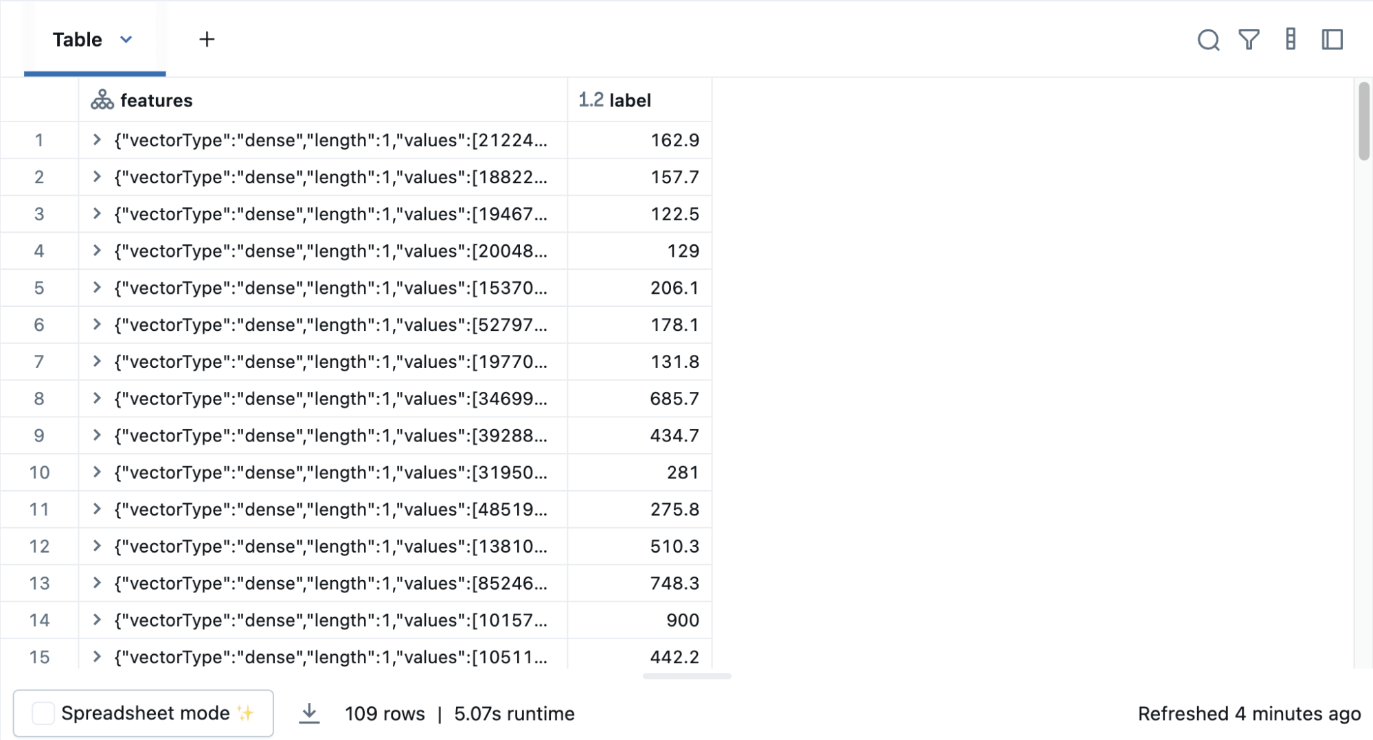
In supervised learning—-such as a regression algorithm—-you typically define a label and a set of features. In this linear regression example, the label is the 2015 median sales price and the feature is the 2014 Population Estimate. That is, you use the feature (population) to predict the label (sales price).
First drop rows with missing values and rename the feature and label columns, replacing spaces with _.
To simplify the creation of features, register a UDF to convert the feature (2014_Population_estimate) column vector to a VectorUDT type and apply it to the column.
Then display the new DataFrame:
Run the linear regression model
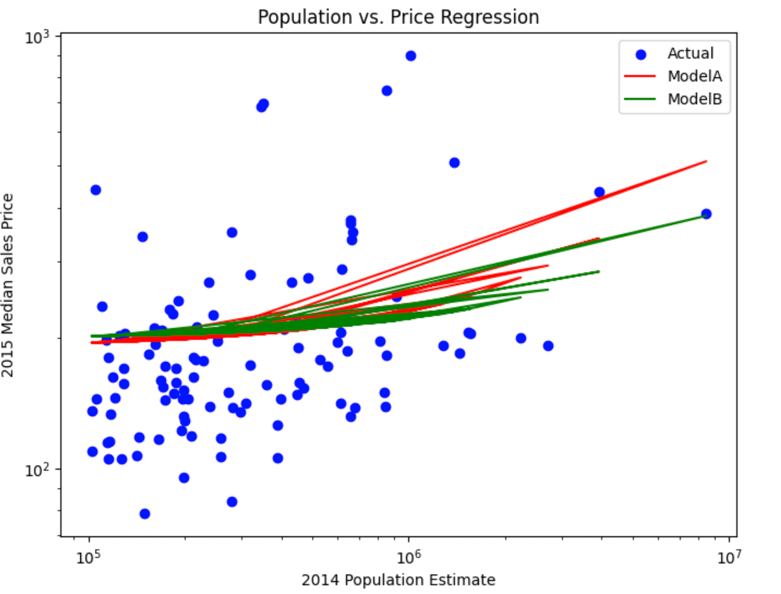
In this section, you run two different linear regression models using different regularization parameters to determine how well either of these two models predict the sales price (label) based on the population (feature).
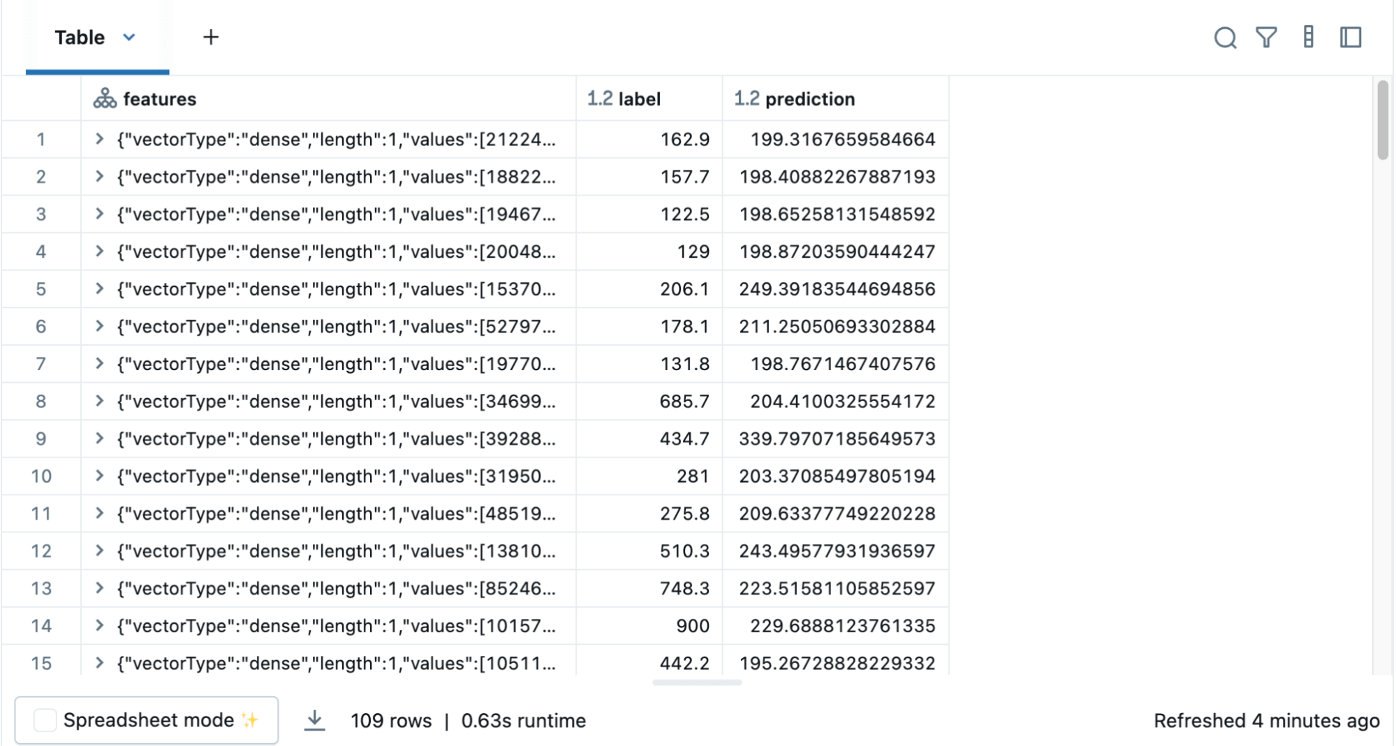
Build the model
Using the model, you can also make predictions by using the transform() function, which adds a new column of predictions. For example, the code below takes the first model (modelA) and shows you both the label (original sales price) and prediction (predicted sales price) based on the features (population).
Evaluate the model
To evaluate the regression analysis, calculate the root mean square error using the RegressionEvaluator. Here is the Python code for evaluating the two models and their output.
Visualize the model
As is typical for many machine learning algorithms, you want to visualize the scatter plot. Since Databricks supports pandas and Matplotlib, the code below creates a linear regression plot using pandas DataFrame and Matplotlib to display the scatter plot and the two regression models.
We also provide a sample notebook that you can import to access and run all of the code examples included in the module.