Understanding your Apache Spark Application Through Visualization
by Andrew Or
The greatest value of a picture is when it forces us to notice what we never expected to see.
- John Tukey
In the past, the Apache Spark UI has been instrumental in helping users debug their applications. In the latest Spark 1.4 release, we are happy to announce that the data visualization wave has found its way to the Spark UI. The new visualization additions in this release includes three main components:
- Timeline view of Spark events
- Execution DAG
- Visualization of Spark Streaming statistics
This blog post will be the first in a two-part series. This post will cover the first two components and save the last for a future post in the upcoming week.
Timeline View of Spark Events
Spark events have been part of the user-facing API since early versions of Spark. In the latest release, the Spark UI displays these events in a timeline such that the relative ordering and interleaving of the events are evident at a glance.
The timeline view is available on three levels: across all jobs, within one job, and within one stage. On the landing page, the timeline displays all Spark events in an application across all jobs. Consider the following example:
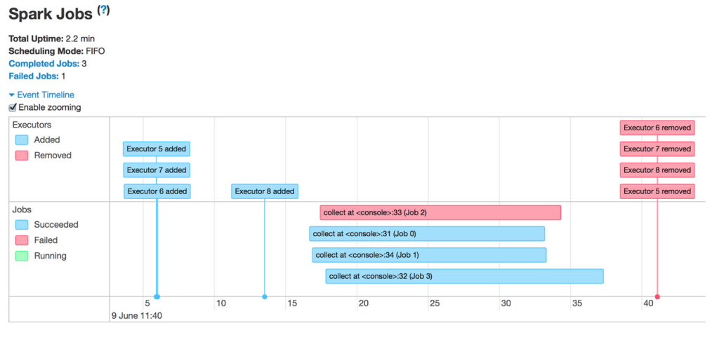
The sequence of events here is fairly straightforward. Shortly after all executors have registered, the application runs 4 jobs in parallel, one of which failed while the rest succeeded. Then, when all jobs have finished and the application exits, the executors are removed with it. Now let’s click into one of the jobs.
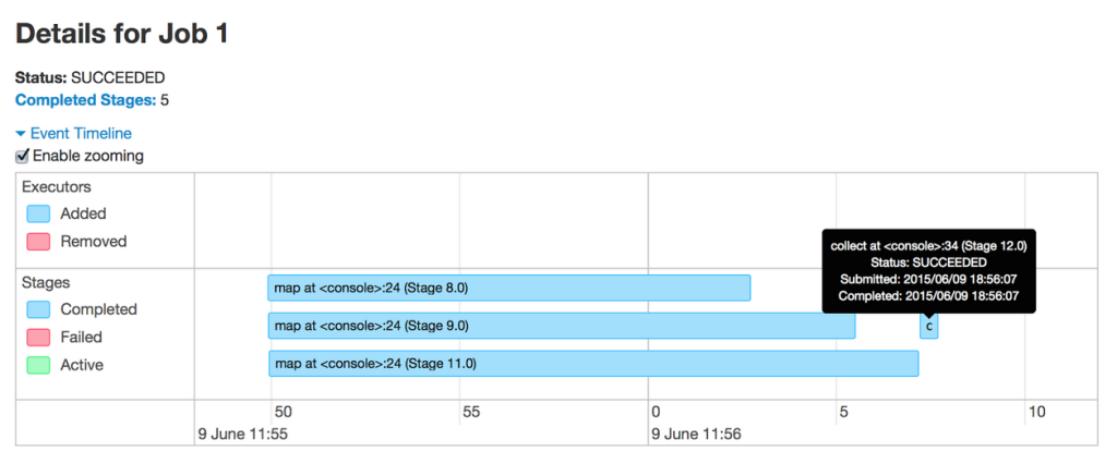
This job runs word count on 3 files and joins the results at the end. From the timeline, it’s clear that the the 3 word count stages run in parallel as they do not depend on each other. However, the join at the end does depend on the results from the first 3 stages, and so the corresponding stage (the collect at the end) does not begin until all preceding stages have finished. Let’s look further inside one of the stages.
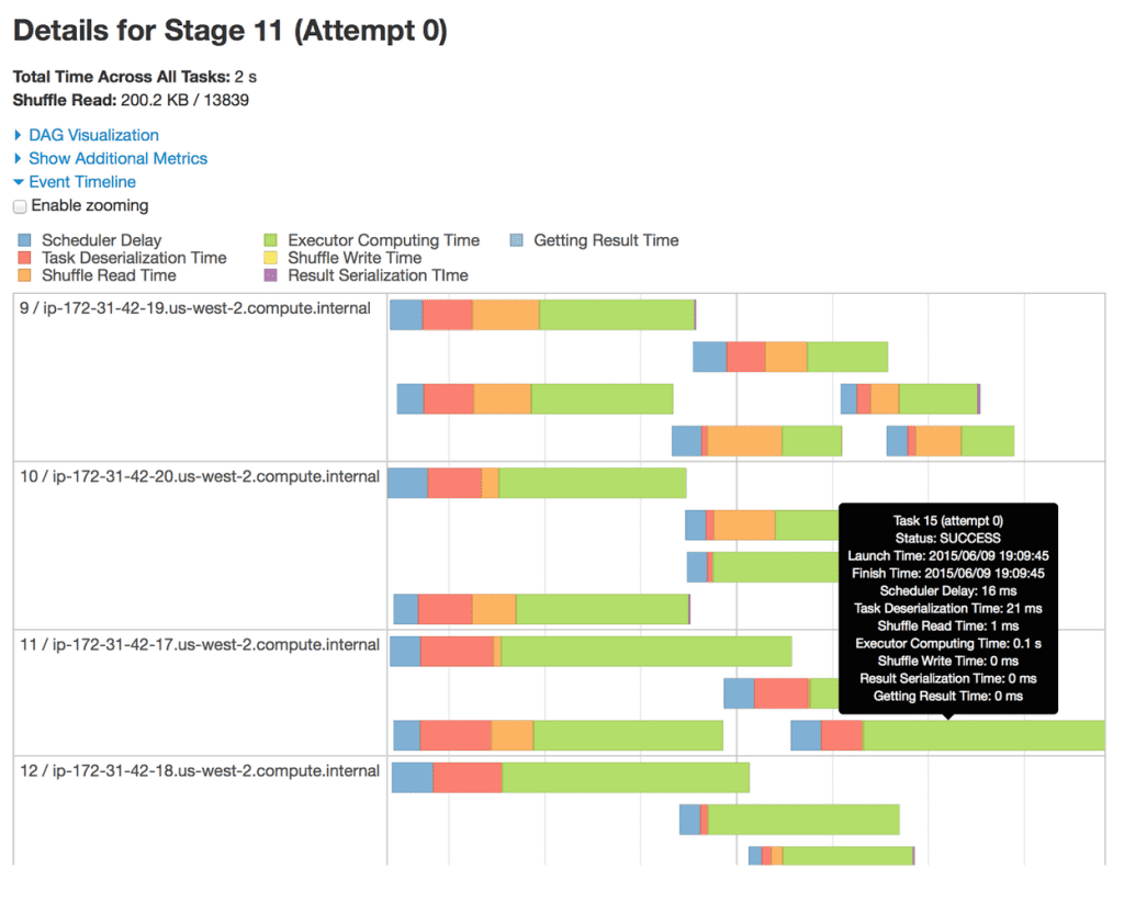
This stage has 20 partitions (not all are shown) spread out across 4 machines. Each bar represents a single task within the stage. From this timeline view, we can gather several insights about this stage. First, the partitions are fairly well distributed across the machines. Second, a majority of the task execution time comprises of raw computation rather than network or I/O overheads, which is not surprising because we are shuffling very little data. Third, the level of parallelism can be increased if we allocate the executors more cores; currently it appears that each executor can execute no more than two tasks at once.
I would like to take the opportunity to showcase another feature in Spark using this timeline: dynamic allocation. This feature allows Spark to scale the number of executors dynamically based on the workload such that cluster resources are shared more efficiently. Let’s see it in action through a timeline.
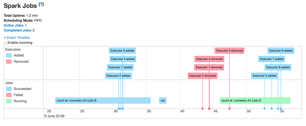
The first thing to note is that the application acquires executors over the course of a job rather than reserving them in advance. Then, shortly after the first job finishes, the set of executors used for the job becomes idle and is returned to the cluster. This allows other applications running in the same cluster to use our resources in the meantime, thereby increasing cluster utilization. Only when a new job comes in does our Spark application acquire a fresh set of executors to run it.
The ability to view Spark events in a timeline is useful for identifying the bottlenecks in an application. The next step in debugging the application is to map a particular task or stage to the Spark operation that gave rise to it.
Execution DAG
The second visualization addition to the latest Spark release displays the execution DAG for each job. In Spark, a job is associated with a chain of RDD dependencies organized in a direct acyclic graph (DAG) that looks like the following:
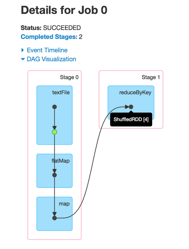
This job performs a simple word count. First, it performs a textFile operation to read an input file in HDFS, then a flatMap operation to split each line into words, then a map operation to form (word, 1) pairs, then finally a reduceByKey operation to sum the counts for each word.
The blue shaded boxes in the visualization refer to the Spark operation that the user calls in his / her code. The dots in these boxes represent RDDs created in the corresponding operations. The operations themselves are grouped by the stage they are run in.
There are a few observations that can be garnered from this visualization. First, it reveals the Spark optimization of pipelining operations that are not separated by shuffles. In particular, after reading from an input partition from HDFS, each executor directly applies the subsequent flatMap and map functions to the partition in the same task, obviating the need to trigger another stage.
Second, one of the RDDs is cached in the first stage (denoted by the green highlight). Since the enclosing operation involves reading from HDFS, caching this RDD means future computations on this RDD can access at least a subset of the original file from memory instead of from HDFS.
The value of the DAG visualization is most pronounced in complex jobs. As an example, the Alternating Least Squares (ALS) implementation in MLlib computes an approximate product of two factor matrices iteratively. This involves a series of map, join, groupByKey operations under the hood.
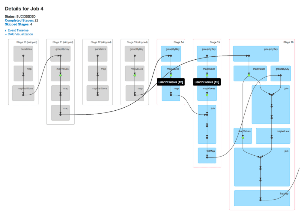
It is worth noting that, in ALS, caching at the correct places is critical to the performance because the algorithm reuses previously computed results extensively in each iteration. With the DAG visualization, users and developers alike can now pinpoint whether certain RDDs are cached correctly at a glance and, if not, understand quickly why an implementation is slow.
As with the timeline view, the DAG visualization allows the user to click into a stage and expand on details within the stage. The following depicts the DAG visualization for a single stage in ALS.
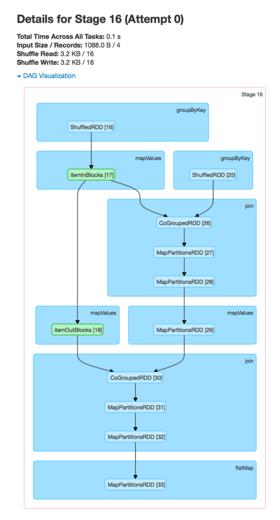
In the stage view, the details of all RDDs belonging to this stage are expanded automatically. The user can now find information about specific RDDs quickly without having to resort to guess and check by hovering over individual dots on the job page.
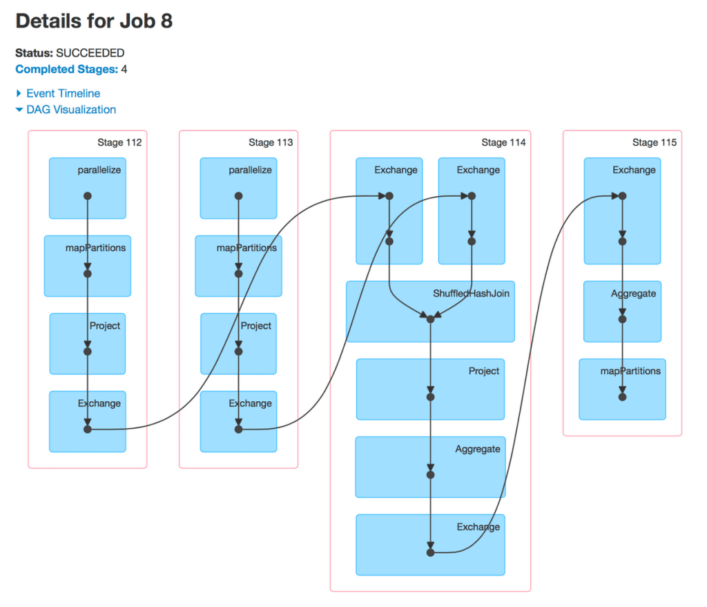
Lastly, I would like to highlight a preliminary integration between the DAG visualization and Spark SQL. Since Spark SQL users are more familiar with higher level physical operators than with low level Spark primitives, the former should be displayed instead. The result is something that resembles a SQL query plan mapped onto the underlying execution DAG.
Integration with Spark Streaming is also implemented in Spark 1.4 but will be showcased in a separate post.
In the near future, the Spark UI will be even more aware of the semantics of higher level libraries to provide more relevant details. Spark SQL will be given its own tab analogous to the existing Spark Streaming one. Within Spark Core, additional information such as number of partitions, call site, and cached percentages will be displayed on the DAG when the user hovers over an RDD.
Summary
The latest Spark 1.4.0 release introduces several major visualization additions to the Spark UI. This effort stems from the project’s recognition that presenting details about an application in an intuitive manner is just as important as exposing the information in the first place. Future releases will continue the trend of making the Spark UI more accessible to users of both Spark Core and the higher level libraries built on top of it.
Stay tuned for the second half of this two-part series about UI improvements in Spark Streaming!
Acknowledgment
The features showcased in this post are the fruits of labor of several contributors in the Spark community. In particular, @sarutak of NTT Data is the main author of the timeline view feature.
Get the latest posts in your inbox
Subscribe to our blog and get the latest posts delivered to your inbox.