Visualizing Machine Learning Models
by Joseph Bradley, Feynman Liang, Tim Hunter and Raela Wang
To try the new visualization features mentioned in this blog, sign up for a 14-day free trial of Databricks today.
You've built your machine learning models and evaluated them with error metrics, but do the numbers make sense? Being able to visualize models is often a vital step in advanced analytics as it is usually easier to understand a diagram than numbers in a table.
Databricks has a built-in display() command that can display DataFrames as a table and create convenient one-click plots. Recently, we have extended the display() command to visualize machine learning models as well.
In this post, we will look at how easy visualization can be with Databricks -- a quick display() command can give you immediate feedback about complex models!
Linear Models: Fitted vs Residuals
Scala-only
The Fitted vs Residuals plot is available for Linear Regression and Logistic Regression models. The Databricks’ Fitted vs Residuals plot is analogous to R's “Residuals vs Fitted” plots for linear models.
Here, we will look at how these plots are used with Linear Regression.
Linear Regression computes a prediction as a weighted sum of the input variables. The Fitted vs Residuals plot can be used to assess a linear regression model's goodness of fit.
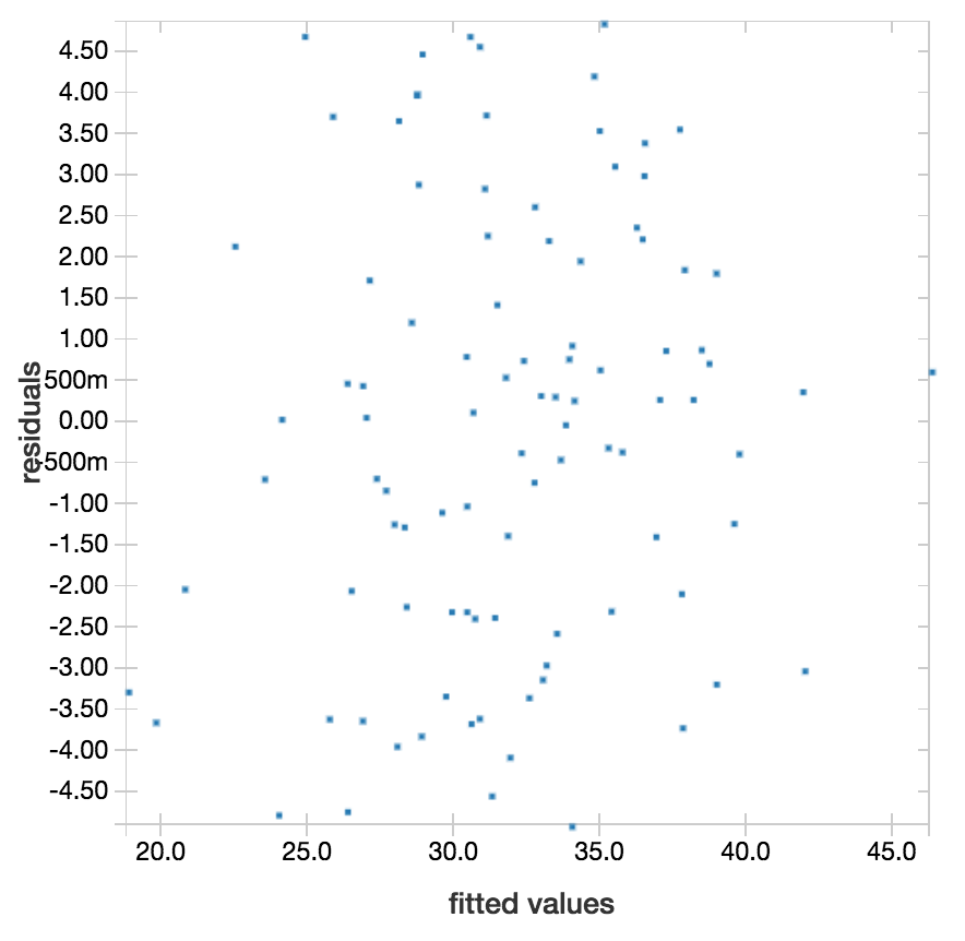
The above is an example of a fitted vs residuals plot for a linear regression model that is returning good predictions. A good linear model will usually have residuals distributed randomly around the residuals=0 line with no distinct outliers and no clear trends. The residuals should also be small for the whole range of fitted values.
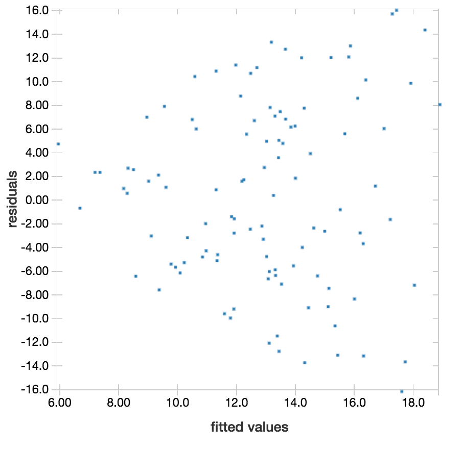
In comparison, this visualization is a warning sign for this linear regression model: the range of residuals increases as the fitted values increase. This could mean we should evaluate using relative error instead of absolute error.
K-means Clustering: Visualizing Clusters
K-means tries to separate data points into clusters by minimizing the sum of squared errors between data points and their nearest cluster centers.
We can now visualize clusters and plot feature grids to identify trends and correlations. Each plot in the grid corresponds to 2 features, and data points are colored by their respective cluster labels. The plots can be used to visually assess how well your data have been clustered.
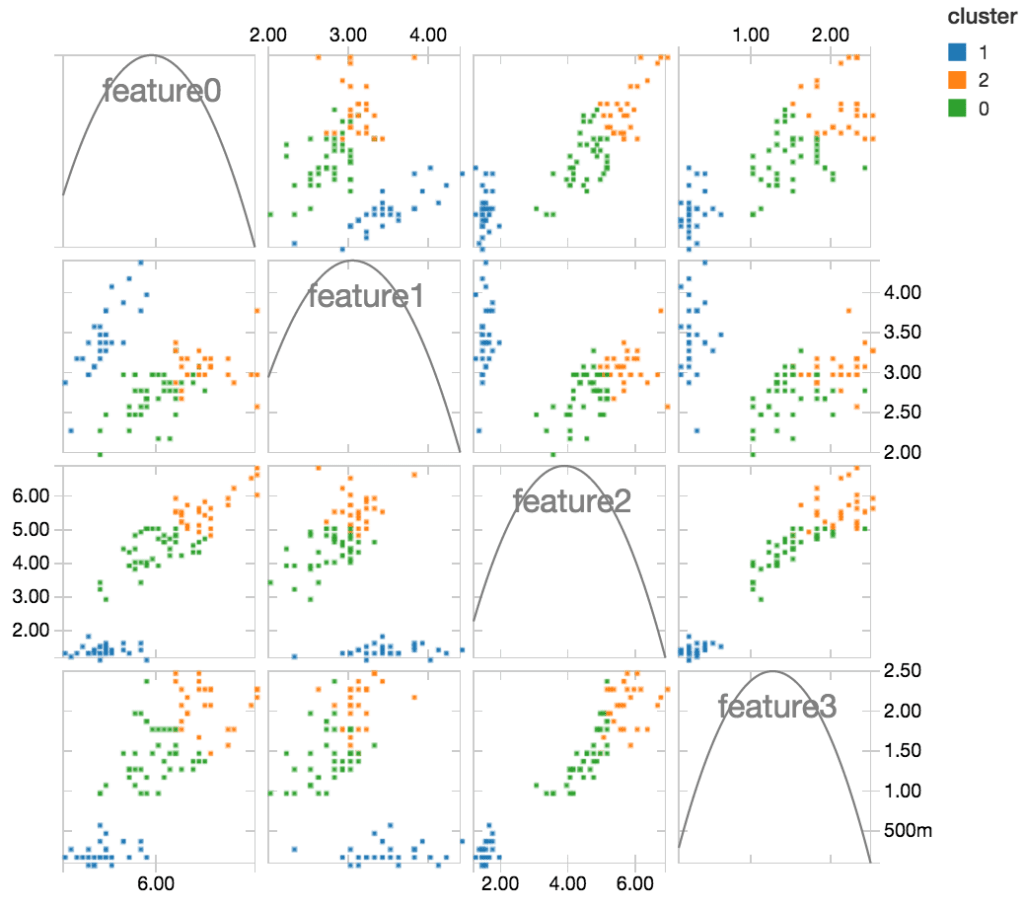
From these plots, we notice that clusters 0 and 2 are sometimes overlapping with each other for some features, whereas cluster 1 is always cleanly separated from the rest. Features 2 and 3 are particularly useful for distinguishing cluster 1.
Logistic Regression: ROC Curves
Scala-only, with clusters running Apache Spark 1.5 or higher
Logistic Regression is widely used for binary classification, where a logistic function is used to model the class probabilities of your data.
Logistic Regression converts a numerical class probability into a binary (0/1) label using a threshold, and adjusting the threshold allows you to adjust the probability cutoff for predicting 0 vs. 1. To review how your model performs over various thresholds, you can easily plot your model’s ROC Curve with the display() command. The plot will also interactively display threshold values on mouseover.
https://www.youtube.com/watch?v=YVYFdEPCkV0
The dotted diagonal line represents how a model will perform if it randomly guesses every prediction, and the (0.00,1.00) point in the top left corner represents a perfect classification. From the above curve, it is clear that our model is doing much better than random guessing, and we can adjust the threshold based on how much we value true positive vs. false positive predictions.
To see an example of these visualizations and try out the interactive display, check out the exported notebook here.
What's Next?
The plots listed above as Scala-only will soon be available in Python notebooks as well. There are also other machine learning model visualizations on the way. Stay tuned for Decision Tree and Machine Learning Pipeline visualizations!
Get the latest posts in your inbox
Subscribe to our blog and get the latest posts delivered to your inbox.