Take Reports From Concept to Production with PySpark and Databricks
Introduction: What is MediaMath?
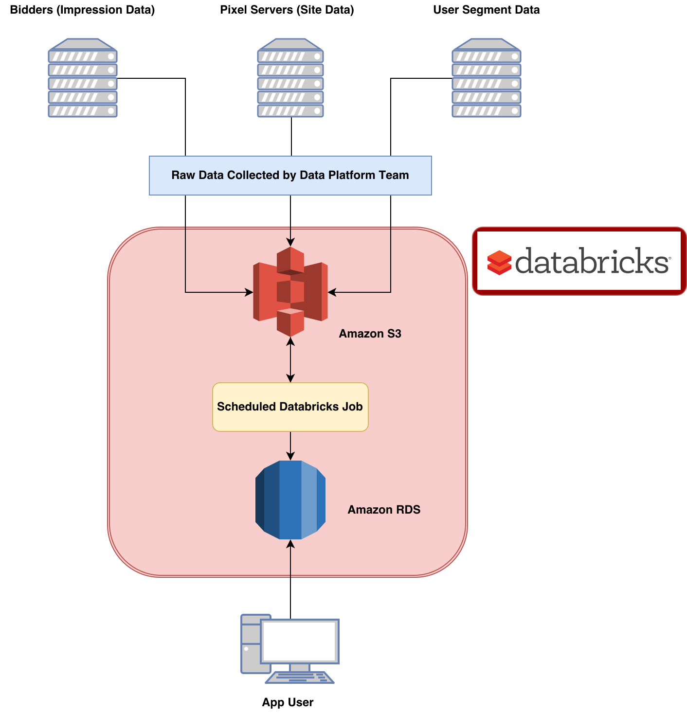
MediaMath is a demand-side media buying and data management platform. This means that brands and ad agencies can use our software to programmatically buy advertisements as well as manage and use the data that they have collected from their users. We serve over a billion ads each day, and track over 4 billion events that occur on the sites of our customers on a busy day. This wealth of data makes it easy to imagine novel reports in response to nearly any situation. Turning these ideas into scalable products consumable by our clients is challenging however.
Reporting at MediaMath
Typically the life cycle of a new report we dream up is:
Proof of concept is easy. All it takes is a novel client request or a bright idea combined with a scrappy analyst, and you’ve got a great idea for a new product. Building a proof of concept into a custom web app is harder, but should be achievable by a savvy team with a few days to dedicate to the project. Including the report in the core product is often prohibitively hard, as it requires coordination between potentially many teams with potentially competing priorities. This blog will focus on the second stage of this process: Turning a concept report into a scalable web app for client consumption, a process that Databricks has significantly streamlined for us.
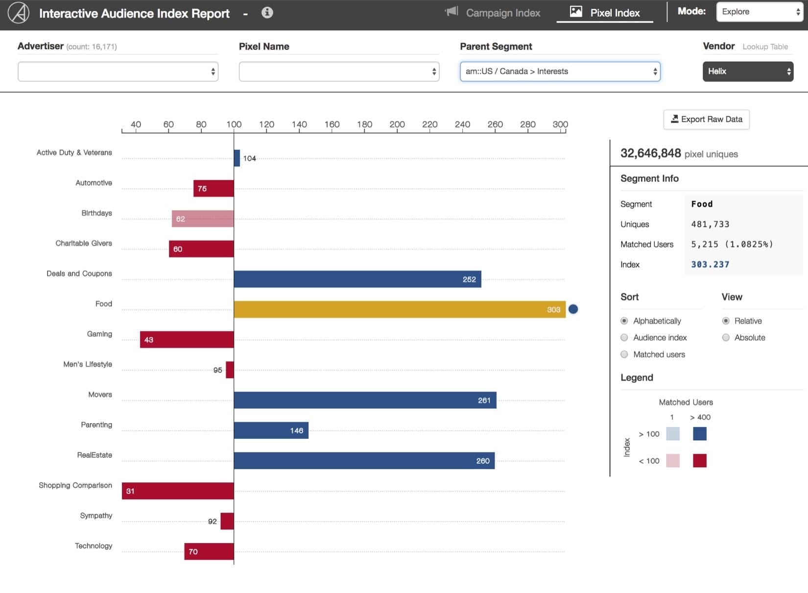
The Audience Index Report: What is it?
The Audience Index Report (AIR) was developed to help current MediaMath clients understand the demographic makeup of users visiting their sites. Using segment data containing (anonymized of course) demographic and behavioral data of our users, the AIR provides a measure of the observed number of site-visitors from a segment compared to the expected number of site-visitors from that segment. The measure of this difference is referred to as the Index for segment ? and site (also referred to as ‘pixel’) ?. Please refer to the appendix for a more detailed description of the Index. For now, you should know that in order to compute the index for a site-segment you need to know four quantities:
- |? ∩ ?| : the number of users in segment ? who also fired pixel ? (a pixel is used to track site visits)
- |?? ∩ ?| : the number of users in segment group ? who also fired pixel ? (? is the collection of segments to which ? belongs)
- |?| : the number of users in segment ?
- |??| : the number of users in the segment group ?
Knowing the index of a site-segment is useful because it allows MediaMath clients to quantify the demographic and behavioral features of the users browsing their web content. It also is beneficial to our partners, because our clients can take insights gleaned from the report and then target an appropriate audience population (also known as a segment) by buying data from our partners.
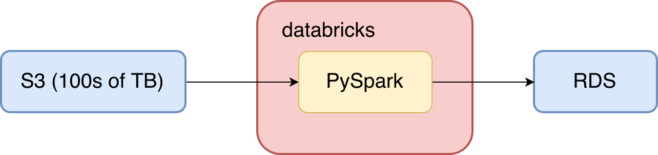
Producing the AIR - Why Databricks?
At a very high level, producing the AIR requires the following:
- Process segment data to make it useable
- Join processed segment data to first party data and aggregate
- Write results to a relational database to serve our web app
I chose to implement this workflow with Apache Spark in the end, despite how primarily ETL heavy it was. I chose Spark for a couple of reasons, but it was primarily because much of the processing required was awkward to express with SQL. Spark’s RDD APIs for Python provided the low-level customization I needed for the core ETL work. Additionally RDDs are readily transformed into DataFrames, so once I was done with the messy transformations I could slap a schema on my RDDs and use the very convenient DataFrame APIs to further aggregate them or write the results to S3 or a database.
The Databricks platform was also convenient because it brought all of the overhead required to run this workflow into one place. The Databricks UI is focused on notebooks, which suits this workflow well. I was able to create a couple of classes that handled all of the ETL, logic, logging and extra monitoring that I needed. I imported these classes into a handler notebook and used the Databricks job scheduler to configure the details of the cluster that this workflow runs on and to run the job itself. Now I’ve got my entire workflow running from just one Python notebook in Databricks! This convenience sped up the development process tremendously compared to previous projects and was just a lot more fun.
Processing segment data
Let’s dig into how this report is generated. A user is defined to be ‘in segment’ if they have been added to the segment at least once in the last 30 days. Given this definition, the most useful format for the segment data is a key/value system. I will refer to this dataset as UDB (User DataBase). I chose to store the records as sequence files in S3 with the following structure:
| Key | Value |
|---|---|
| UserID | Nested Dictionary with segmentID and max and min timestamps corresponding to the time when the user was added to the segment. |
Here is an example of one record from UDB:
An added bonus here is that the first party data can be stored in exactly this same way, only in place of the segmentID we use pixelID (an identifier for the site). We produce this dataset by using the new day’s data to update the current state of UDB each day. Here’s what this step looks like:
We are well prepared now for Step 2: Joining and aggregating the data.
Joining data and aggregating
Since our intent is to understand the demographic information for each site, all we have to do is join the Site data to UDB. Site data and UDB are both stored as pairRDDs and are readily joined to produce a record like this:
After the join it’s just a matter of counting up all of the siteID-segmentID and siteID-segmentGroup combinations we saw. This sounds easy, but it is the ugly part. Since one active user may have visited many sites and be in many segments, exploding the nested records actually causes quite a bit of extra data (up to |?| ⋅ |?| records for each user) so care must be taken to maintain an appropriate level of parallelism here. Using our example above, our result dataset would look like this:
Notice how there are only seven lines here rather than nine. This is because we enforce the condition that a user must be in a segment before the first time they visit a site in order to be included in this report. Two records are scrubbed out here for that reason. Now I can convert this dataset into a DataFrame and aggregate it appropriately (count() grouping by site and segment). Since the result is itself a DataFrame, we are well set up for step 3 - writing to the relational database. This is the workflow for |? ∩ ?|. The workflow for |? ∩ ??| is similar, and I’ll omit it.
Writing to the relational database
We use an AWS hosted PostgreSQL RDS to serve data to our web-app. Spark’s JDBC connector makes it trivial to write the contents of a DataFrame to a relational database such as this. Using PySpark and Postgres, you can run something like this:
You can even bake table management into your class methods to streamline the process of updating a live table. For example if you can’t use the mode=overwrite option of the write.jdbc() method (since the target table may be a production table you don’t want to be down while you overwrite it), you can define a function like this:
Conclusion
Now we’ve got everything in an Amazon RDS where careful database design allows our app to serve data quickly. We’ve managed to take hundreds of terabytes of data (this report aggregates the last 30 days) and condense it into a consumable report widely used by clients at MediaMath. Databricks provides a convenient platform to abstract away the painful parts of the orchestration and monitoring of this process. With Databricks we were able to focus on the features of the report rather than overhead, and have fun while we were doing it.
Get the latest posts in your inbox
Subscribe to our blog and get the latest posts delivered to your inbox.