What’s New in AI/BI - April 2025 Roundup
A redesigned Genie user experience, suggested follow-on questions, file upload, Git folders support and more!

Published: April 21, 2025
by Richard Tomlinson, Eason Gao, Hanlin Sun and Alex Lichen
Summary
- Discover the redesigned Genie user interface, suggested follow-on questions, and file upload capabilities for enhanced conversational analytics.
- Explore new Dashboard features, including calculated dimensions, Git folders integration, and Dashboard tasks for Jobs.
- Learn about upcoming roadmap features, such as global filters, drill-through, AI Forecasting, and the new Consumer role for non-technical users.
Introduction
Since our last roundup in February, Databricks AI/BI Dashboards and Genie have received even more exciting enhancements, making our native analytical offering more intuitive, intelligent, and powerful for everyone in your organization.
If you're new to AI/BI, it's a fully integrated suite of Business Intelligence capabilities within Databricks SQL that requires no additional licenses, so be sure to check it out today. AI/BI allows users to explore, analyze, and share insights effortlessly across the entire organization without managing licenses, data extracts or a shadow data warehouse.
What’s New in AI/BI?
Let’s first examine some of the major new headline features in AI/BI Genie and Dashboards.
Updated Genie space user interface
We’ve restructured the Genie UI for a cleaner authoring and consumption experience. The new layout gives more screen space to the instructions and data tabs, making it easier to iterate on your instructions alongside a Genie conversation thread. You can also more easily see details about your data columns and descriptions without needing to navigate to the Catalog Explorer.
Additionally, after you close the new configuration panel, you get much more screen space for your chat conversation, making it easier to read result tables and visualizations.
Genie suggested follow-up questions
Genie will now suggest follow-up questions to your original prompts. These suggestions help users continue to explore their data in ways they may not have thought of previously. They also teach business users what types of questions they can ask in Genie and how to phrase them properly. To generate these suggested questions, we use the context of previous prompts in a conversation alongside table metadata and instructions.
Genie file upload
The new Genie file upload feature—available in Gated Public Preview—allows users to simply drag and drop Excel or CSV files into Genie for analysis and blend them with existing data from Unity Catalog for even deeper insights. This feature is useful for quick data validation, lightweight analysis, and working with external datasets without additional setup.
For example, say you need to join demographic data from a CSV file with restaurant inspection data stored in Unity Catalog using a ZIP code field as the common key. You can now just drag in your CSV file and answer data questions using both sources directly in the Genie UI. There’s no need for complex data ingestion or waiting for data practitioners to add in the new data.
Dashboard tasks for Jobs
Users can now add an AI/BI Dashboard refresh as a task in Jobs. This is useful when you want to trigger a dashboard refresh and optionally send PDF snapshots via email immediately after a data pipeline refresh has been completed.
Calculated dimensions
In our last blog, we introduced calculated measures for AI/BI Dashboards. We’re now expanding this capability with the addition of calculated dimensions. Calculated dimensions allow authors to create new dimension fields directly within the dashboard—without modifying the underlying dataset.
With this enhancement, you can define logical groupings or classifications (such as customer segments, age brackets, or product categories) using familiar ANSI SQL expressions, including new support for syntax like CASE WHEN, COALESCE(), and more—eliminating the need to learn a proprietary modeling language.
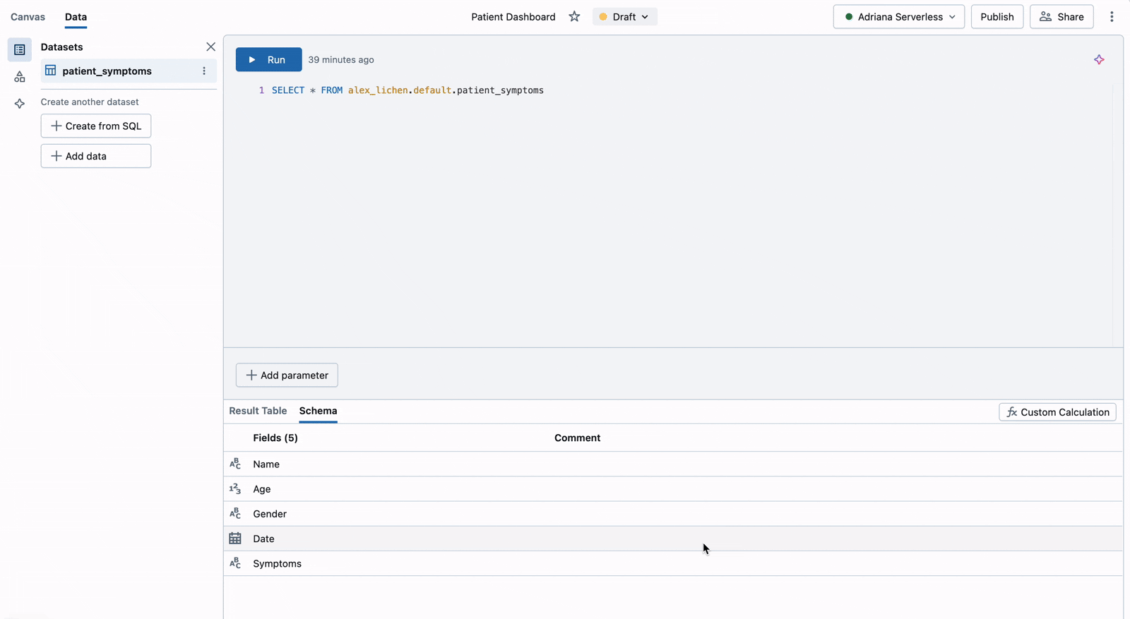
To define a calculated dimension, go to the Data tab, select or create a dataset, and click the Custom Calculation button. From there, you can enter a name, an optional description, and a SQL expression to define the dimension. Similar to calculated measures, calculated dimensions are fully integrated with dashboard visualizations and filters—enabling you to uncover new perspectives on your data while preserving fast, efficient performance. See our documentation for the full list of supported functions.
Git folders integration for Dashboards
Git folders integration for AI/BI Dashboards is now in Public Preview. This feature allows you to store and manage dashboards within Git-linked folders, just like notebooks and other workspace assets. By organizing dashboards in Git folders, you can version control your BI artifacts, collaborate through pull requests, and integrate dashboards into existing CI/CD workflows—enabling consistent, auditable, and production-grade development practices for business intelligence.
Other notable features
Beyond these headlines, there are even more new features to highlight. Some noteworthy updates are included below; for a complete list of features and fixes, please refer to the AI/BI product release notes.
AI/BI Dashboards
Sankey visualizations are now available on AI/BI Dashboards. These diagrams are used to show user journeys or flows. Learn more about this visualization type here.
Freeze table columns: You can now freeze table columns to the left side of the table display. Columns stay in view as you scroll right on the table.
Revert draft dashboard to last published: You can quickly restore a draft dashboard to its last published version. This makes it easy to undo unintended changes, manage iterations, and maintain clean, production-ready dashboards. The revert draft to the previous feature is a valuable addition for teams looking to improve usability and lifecycle management as they iterate on their BI assets.
Locale customization for numeric and date/time values is now available. This formats all numbers and date/time values on a dashboard according to the author's chosen locale.
Pivot tables now support up to 1,000 rows and 1,000 columns, up from the previous limit of 100 rows and 100 columns.
AI/BI Genie
Genie Conversation APIs. As outlined in our recent blog, the Genie Conversations API is now in Public Preview. With this new suite of APIs, you can programmatically embed AI/BI Genie into popular apps like Slack, Microsoft Teams, Sharepoint or Databricks Apps. You can also use the Conversation APIs to seamlessly integrate Genie with Mosaic AI Agent Frameworks.
Feedback Labels. We’ve made it easier for users to give helpful feedback on Genie answers. They can now choose from common issue types (like “missing column” or “wrong visualization”) and add a short note. This makes it clearer for space editors to understand what went wrong and fix it. Users can also use the labels to re-generate a better answer on the spot.
Customer-managed key (CMK) encryption for chat history. This gives you full control over the encryption of conversational data generated through AI/BI Genie. CMKs for Genie chat history allow you to enforce your own key management policies—such as key rotation and revocation—for added security and compliance. With CMK support, you can better align AI/BI usage with your internal governance standards and protect sensitive Genie interactions. Learn more about Customer-Managed Keys at the Databricks Security and Trust Center.
What’s Next for AI/BI?
As always, our roadmap is full of enhancements designed to make AI/BI more intelligent, user-friendly, and powerful. Many of these features are already available in Private Preview—if you’re interested in trying them out, reach out to your Databricks account team, who will be happy to help you get started.
AI/BI Dashboards
- Global filters. We’ve added global filters to ensure that your selected dashboard filters persist as you navigate across different pages – for example, applying a specific date range across all pages. You can still create filters that are local for each dashboard page—useful, for example, when you want to filter on a specific field that is only relevant for one of your dashboard pages.
- Dashboards embedding with app-level authentication. This feature allows you to embed a dashboard securely in an application while ensuring user level data controls configured in the app are respected in the Databricks data displayed.
- Dashboard tags. Tags allow users to label AI/BI Dashboards to improve organization, categorization, and discoverability within the workspace. These tags enhance search functionality, making it easier to quickly find and manage dashboard assets across your environment.
- AI Forecasting. For any line chart with a temporal based x-axis and a single y-axis value, authors can click “forecast” to project out the values into the future. Built on the ai_forecast() function, this new capability makes it easier than ever to project future trends and patterns from your existing dashboard visualizations.
- Key drivers analysis. When you see an anomaly on a dashboard and want to know what might be causing it, key drivers analysis allows you to simply right-click on the data point to break down the metric and understand what might be causing the anomaly. You’ll get a detailed summary of what dimensions are responsible for the increase in the metric, and the ability to slice and dice those dimensions for drilled-in understanding.
- Choropleth Maps. These maps help you visualize country, state (or province), and county-level data by shading regions for any measure you pick. For example, you can quickly visualize average price by county to identify regional trends, spot outliers, and make more informed, location-specific business decisions.
- Dashboard theming. You can pick a set of colors to be used across all visualizations, enabling your dashboards to match your brand style. You no longer need to manually apply colors to each individual widget on your dashboard. Additionally, you’ll be able to pick colors for the dashboard background, widget background, and fonts, unlocking full customization over the look and feel of your dashboard.
AI/BI Genie
- Share Genie to account-only users. Share Genie spaces to users and groups registered with the Databricks account who are not members of the originating workspace. Enabled at the account level, this capability is equivalent to "view-only users” in other tools. This makes it very straightforward to ensure a less technical user can always access a shared Genie space without a large amount of ongoing admin work.
- Suggested starter questions. To improve the first-time experience with Genie, we are working on AI-suggested starter questions. These will be displayed when you first open a Genie space and are designed to help new users quickly understand how to interact with Genie.
- Refined instruction primitives. To make it clearer for users how to add semantics and for Genie to understand your data, we are refining the instructions primitives you can add to a space. We are planning to introduce structured ways to define column synonyms, table JOIN relationships, metrics and more.
- Additional clarification of ambiguous prompts. At times, users may accidentally exclude an important piece of information from their prompt. We are improving Genie’s ability to seek clarification more effectively on user prompts.
Learn more about AI/BI
If you are ready to explore the latest in AI/BI, you can choose any of the following options:
- Free Trial: Get hands-on experience by signing up for a free trial.
- Documentation: Dive deeper into the details with our documentation.
- Webpage: Visit our webpage to learn more.
- Demos: Watch our demo videos, take product tours and get hands-on tutorials to see these AI/BI in action.
- Training: Get started with free product training through Databricks Academy
- eBook: Download the Business Intelligence meets AI eBook
Additionally, we will be hosting a webinar on May 6 at 9 AM PT called “Business Intelligence in the Era of AI: How Data Intelligence Delivers Better Decisions” in which you hear from various industry luminaries and learn our perspective on BI and vision for the future. Make sure you sign up for this event today!
And keep an eye out - we have even more innovations coming soon!
Never miss a Databricks post
What's next?


Product
November 21, 2024/3 min read