Databricks, AWS, and SafeGraph Team Up For Easier Analysis of Consumer Behavior

This notebook was produced as a collaboration between SafeGraph and Databricks
- Ryan Fox Squire, Product Data Scientist @ SafeGraph
- Andrew Hutchinson, Solutions Architect @ Databricks
- Prasad Kona, Partner Solutions Architect @ Databricks
We’ve created this Databricks notebook (.dbc download here), and published this blog, so that you can hit the ground running using SafeGraph Data from AWS Data Exchange in Databricks. For ready-to-run code, please see the complementary databricks notebook.
To see the full SafeGraph dataset, visit the SafeGraph Data Bar.
Learn more - register now for this webinar: Building Reliable Data Pipelines for Machine Learning at SafeGraph
This blog will show you:
- How to load SafeGraph Patterns data (a rich dataset on consumer points-of-interest) from AWS s3 (via AWS Data Exchange) into a Databricks notebook.
- How to take full advantage of Databricks Delta Lake technology
- How to use SafeGraph data to analyze offline consumer behavior and foot-traffic to major corporate retail and restaurant brands, like Starbucks.
- What times of day and days of week is Starbucks most popular or least busy?
- How long do customers stay during their visit to Starbucks?
- How far from home do customers travel to visit Starbucks?
- What are the cross-shopping brand preferences of Starbucks customers? What other stores do they visit?
- How can I use SafeGraph data, combined with Census data, to do customer demographic analysis and build customer demographic profiles?
The first half of this notebook shows how to read, load, and prepare the data. The second half shows how to answer analytics questions using spark sql.
Questions? Get in touch with us at [email protected].
What is SafeGraph Patterns?
SafeGraph is a geospatial data company focused on understanding the physical world. SafeGraph Patterns is a dataset of 3.6MM commercial brick-and-mortar points-of-interest (POI) in the USA and includes anonymized counts of how many people visit these POI each month. The counts of visitors are derived from an anonymized panel (sample of population that is measured longitudinally) of ~35MM mobile devices (e.g., smart phones) in the USA.
SafeGraph patterns is designed to answer questions like:
- How many people are visiting a place? How frequently are they visiting?
- How many unique visitors from our panel went to this place?
- On average, what census areas do visitors come from?
- What is the cross-shopping behavior of visitors from one POI to another?
- What times of day and days of the week do people visit?
- How far from home do visitors travel to visit this place?
- How long do people stay at this place when they visit?
Protecting individual consumer privacy is at the core of the SafeGraph mission:
"SafeGraph’s mission is to make the world’s data open for innovation while protecting individuals privacy." - SafeGraph Vision and Values
The devices in the panel are fully anonymized; no identity or demographic information exists for devices in the panel, and individual device-level data is not present in SafeGraph products. The aggregated form of SafeGraph Patterns helps to ensure the protection of individuals' privacy, while also providing actionable data for statistical analysis and data science. For all the details on SafeGraph Patterns, see the SafeGraph Patterns docs.
What is Databricks?
Databricks is a unified analytics platform that enables data science, data engineering and business analytics teams to derive value from data at scale and with ease of use in a collaborative manner.
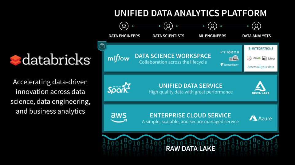
At its core, the Databricks platform is powered by Apache Spark and Delta Lake in a cloud native architecture, which gives users virtually unlimited horse power to acquire, clean, transform, combine and analyze data sets within minutes from a notebook interface, with popular languages of choice (python, scala, SQL, R).
Because Databricks is a managed platform, customers do not have to become big data devops gurus to power their analytical needs, which reduces administrative burden, costs and risks of their data driven projects.
Delta Lake, as also featured in the Safegraph notebooks below, brings unique capabilities to the Databricks platform:
- Reliability: Delta Lake improves the integrity of data sets in the data lake by making data engineering pipelines transactional - ACID semantics, when applied to data engineering and machine learning, give customers confidence they are doing analytics on high quality data and problems such as partially ingested datasets, dirty reads and concurrent consistent access to fresh data are automatically taken care of.
- Performance: Delta Lake has specific optimizations underneath the hoods, such as smart caching, auto-collection of stats, compaction and z-ordering, which speeds up performance of both data engineering pipelines & the reporting done on cleaned data.
Your compact guide to modern analytics
How do we load SafeGraph Patterns from AWS Data Exchange into Databricks Data Lake?
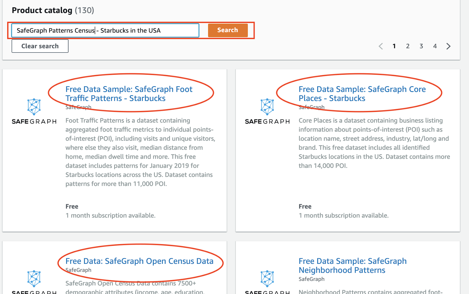
To demonstrate the power of SafeGraph data inside Databricks, we are highlighting three datasets from SafeGraph currently available for free inside AWS Exchange.
- SafeGraph Patterns - Starbucks in the USA
- SafeGraph Core Places - Starbucks in the USA
- SafeGraph Open Census Data
Follow these steps to subscribe to Safegraph datasets in AWS Data Exchange
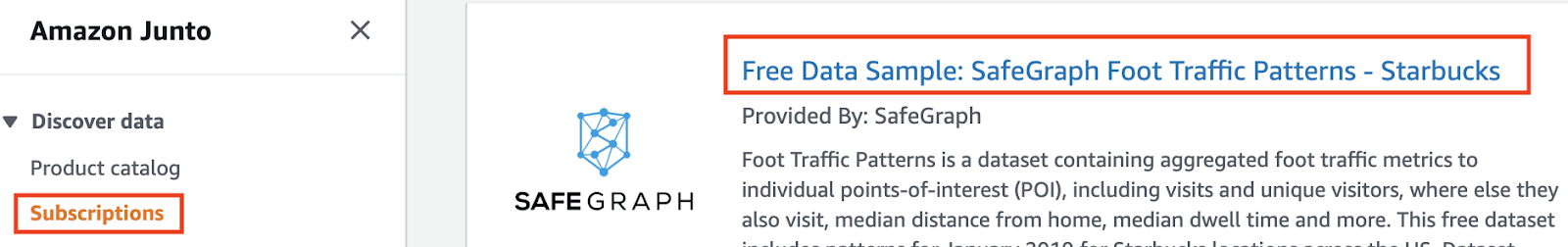
- Goto AWS Data Exchange service in your AWS account and search for “SafeGraph Patterns Census - Starbucks in the USA
- Subscribe to the above 3 Safegraph datasets from AWS Data Exchange UI

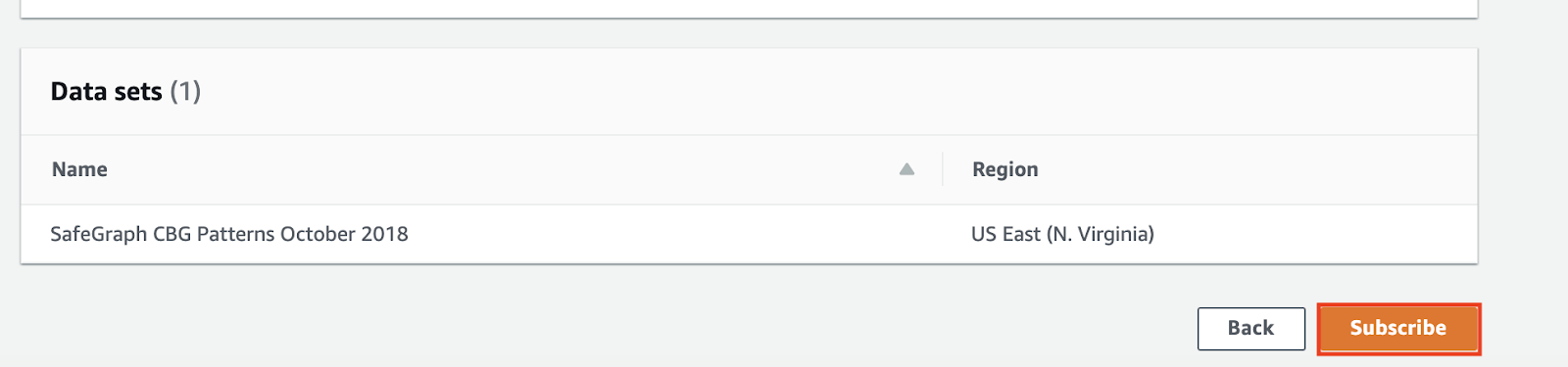
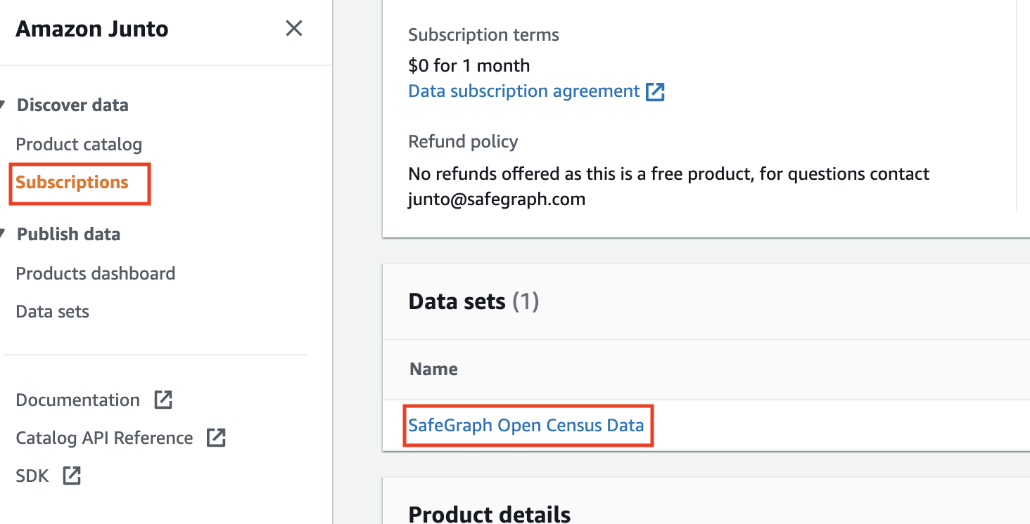
- The subscription process will take a few minutes - once its complete you will see the subscriptions in the Subscriptions UI like below
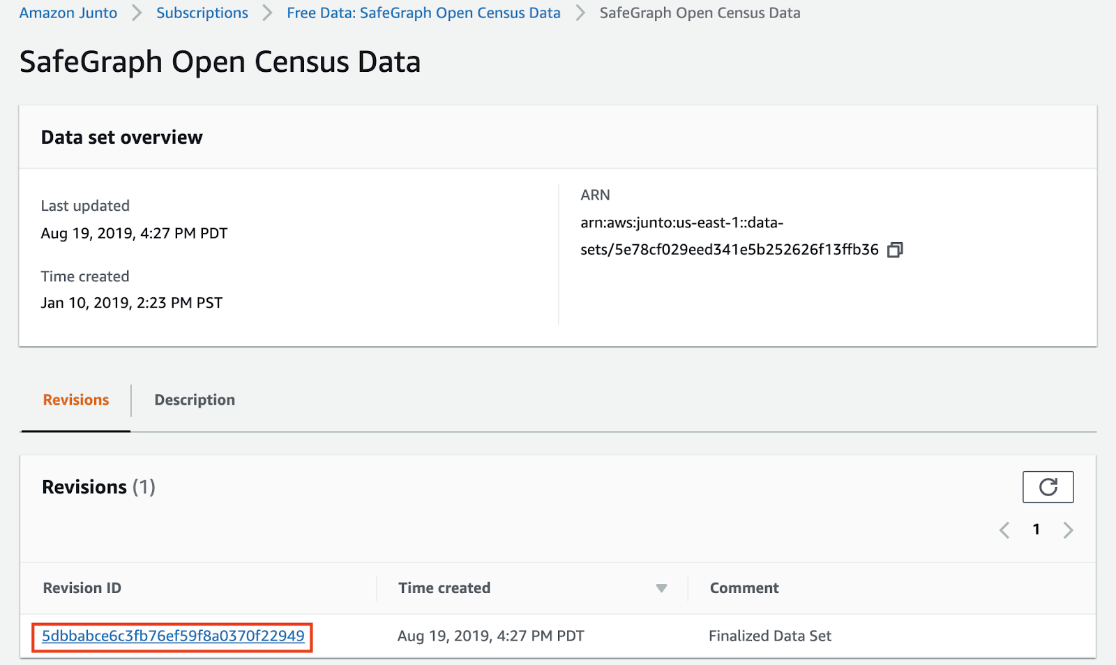
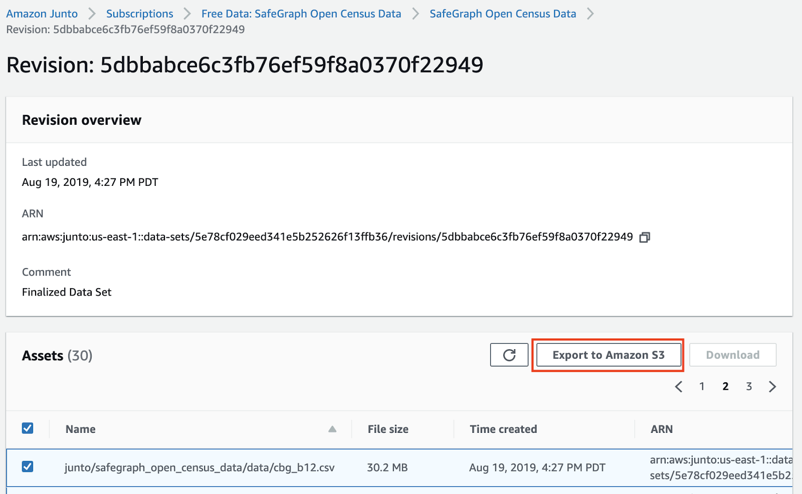
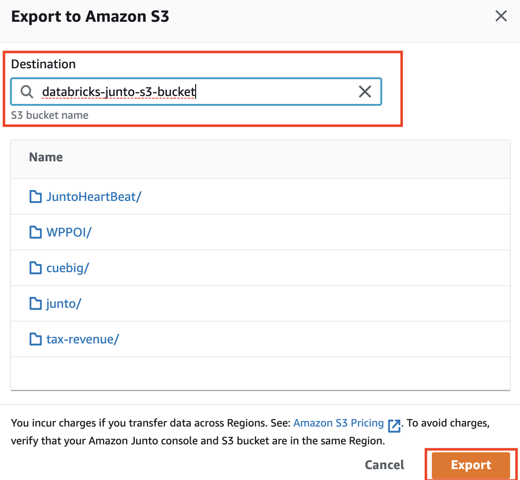
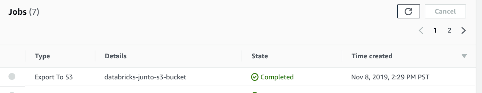
- Import all 3 subscribed datasets into an S3 bucket of your choice by clicking on the data set name in Subscriptions UI and following an export to S3 flow from it’s revision id.
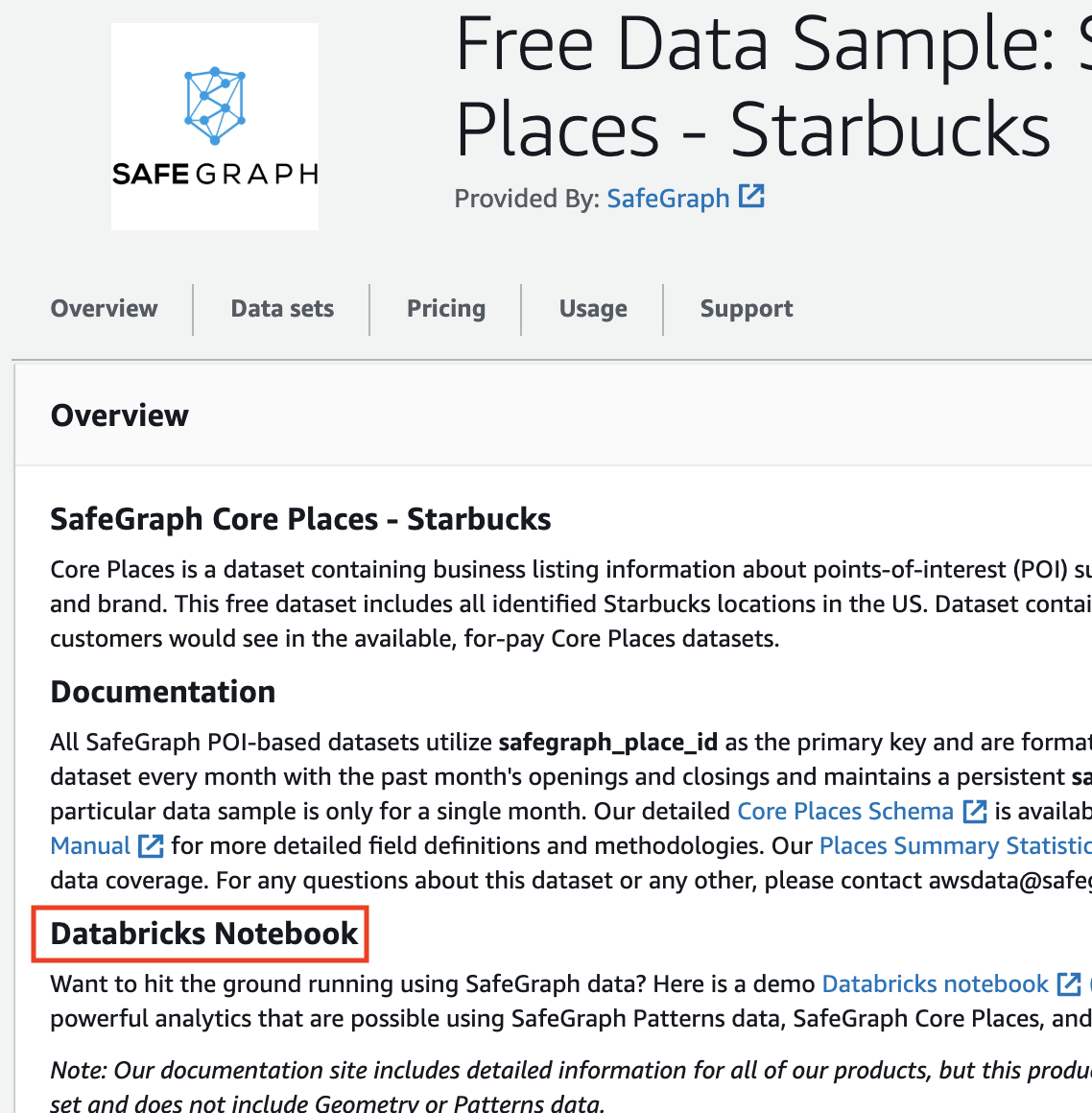
- Once the datasets have been exported to your S3 bucket of choice, download the Databricks notebook from the Databricks link on anyone of the datasets
- Ensure you have access to a Databricks account - a free trial is available here.
- Create and start an interactive Databricks cluster
- Instructions on how to create an interactive Databricks cluster
- A two node i3.2xl cluster should suffice
- Ensure your cluster has rights to access the bucket on which you imported AWS Data Exchange Safegraph datasets
- Look at associating IAM role with Databricks cluster for secure S3 access
- Import Databricks notebook that was downloaded from Safegraphs AWS Data Exchange UI
- Instructions on how to import a noteboo
- Attach imported notebook to cluster
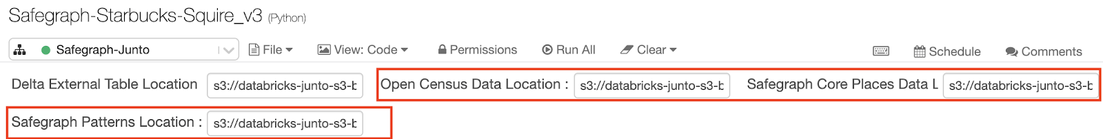
- Update notebook parameter to point to your S3 bucket
- Replace the “Delta External Table Location” parameter at top of notebook to point to a folder of choice on above configured S3 bucket - this is where Databricks will write optimized Delta datasets
- Replace the Open Census, Safegraph Core Place and Safegraph Patterns parameter to point to the respective AWS Data Exchange datasets you imported on your S3 bucket
- Click Run All to execute the notebook
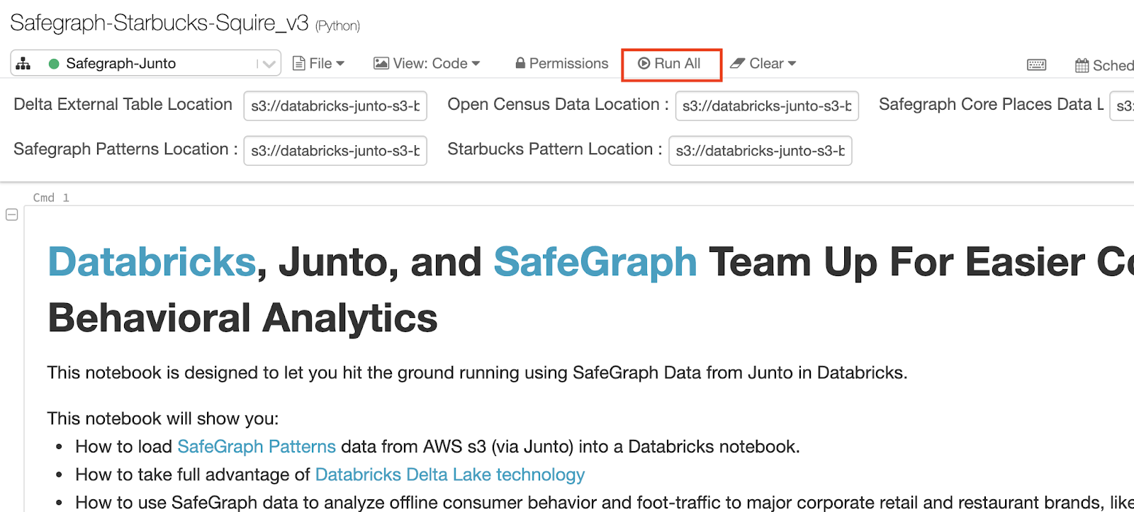
- The notebook then parses, cleans, joins the above datasets and converts them into Delta tables for fast analytics at scale - all this work is executed on the Databricks cluster you created.
- Above is the user experience customers get regardless of the size of data involved - the user focuses on analytics and the underlying Databricks clusters automatically scale to handle petabytes of volume without users having to become big data devops experts.
What can I learn about consumer behavior using SafeGraph data in Databricks?
Once you have SafeGraph data loaded into Databricks, a bunch of exciting answers about consumer behavior are at your fingertips.
To see these implemented in a Databricks notebook, checkout the accompanying Demo Notebook.
What time of day do people visit Starbucks?
With a few lines of code you can examine the relative popularity of individual locations of Starbucks, as well as the average popularity across Starbucks nation-wide. Each safegraph_place_id is a different unique Starbucks location. The x-axis shows each hour of the day (local time) from midnight (0) to 11pm (23). The y-axis reflects how many visits are happening at each hour, summed across all the days of the month, as a percent of total visits of the entire month (Note, visits that cross hour- boundaries will be counted in multiple hours. Therefore, the total % across all hours may add up to > 100%.)
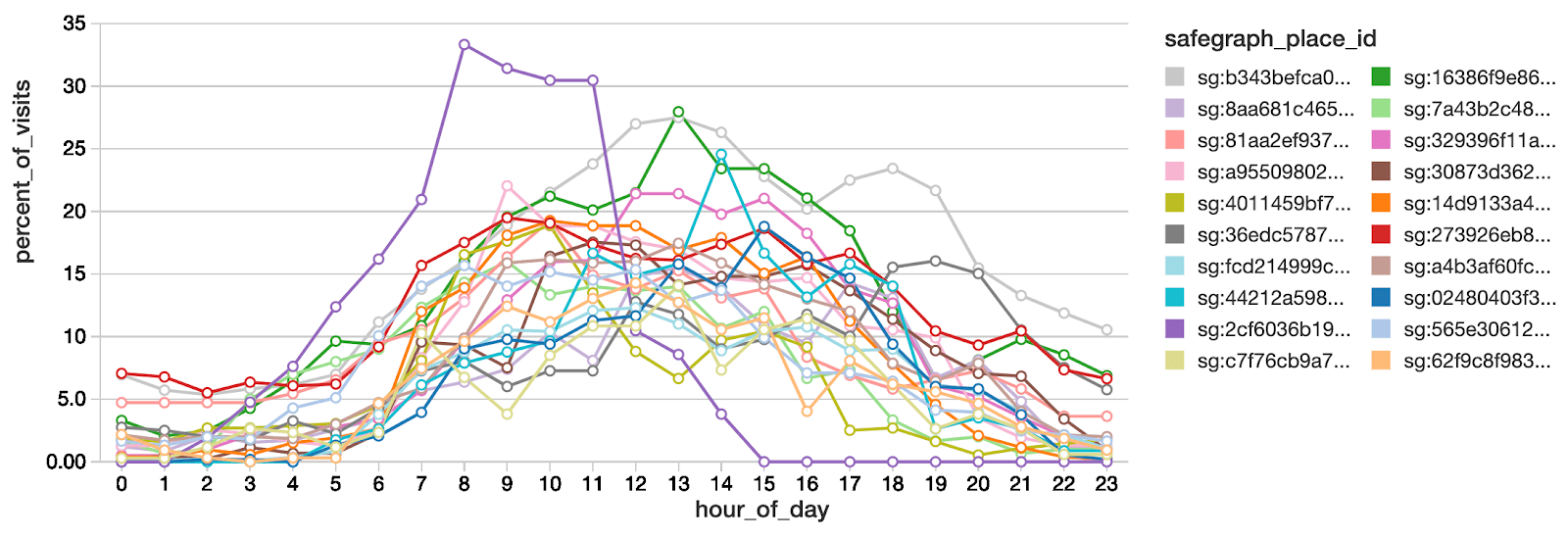
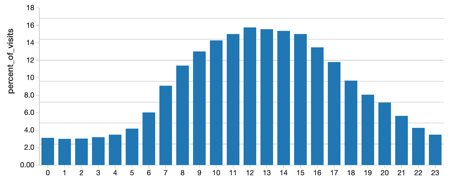
We see that although traffic certainly ramps up during the morning, peak traffic is actually around 12pm and 1pm.
What days of the week do people visit Starbucks?
We can ask the same question but about what days of the week are popular.
Looking at 20 random starbucks examples we see that on average no days are strongly preferred over others. However, some POI do show interesting weekend vs weekday differences.
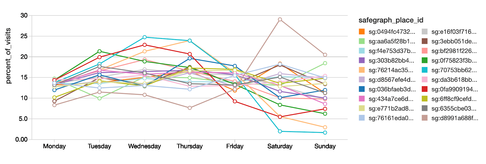
We can examine one of these POI and compare it to the national average.
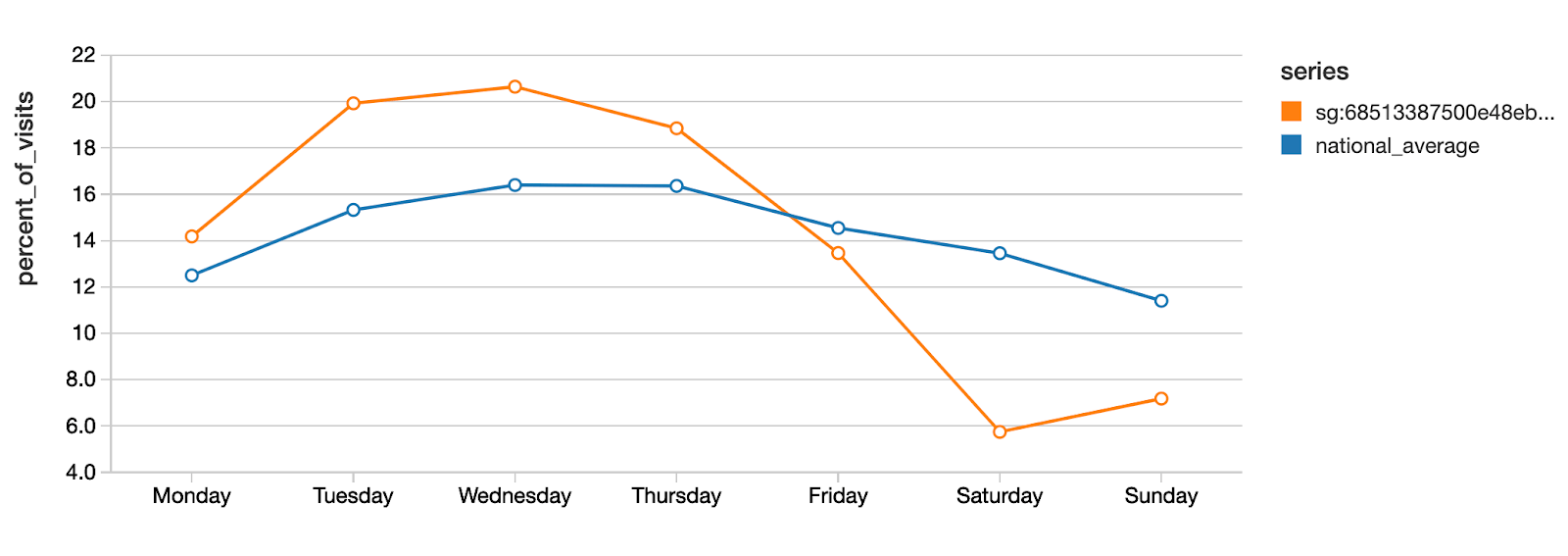
This data shows that, on average nationally, the busiest days of the week at Starbucks are Wednesdays and Thursdays, although this is a mild preference. In contrast, safegraph_place_id sg:68513387500e48eb87d719207d058309 shows a very different pattern and is significantly less popular during the weekends compared to weekdays.
To visualize where this POI is located, you can read the (latitude, longitude) from the SafeGraph dataset and search for it in Google Maps. It turns out that this particular Starbucks is located on the campus of the Boston University School of Law. Presumably the fact that classes are not held during weekends is causing this very large weekday vs weekend difference.
How far do people travel to visit Starbucks?
SafeGraph reports the median distance travelled (from the home census block group) for each POI. Using this we can construct a histogram of Starbucks locations, showing how far people travel to visit Starbucks.
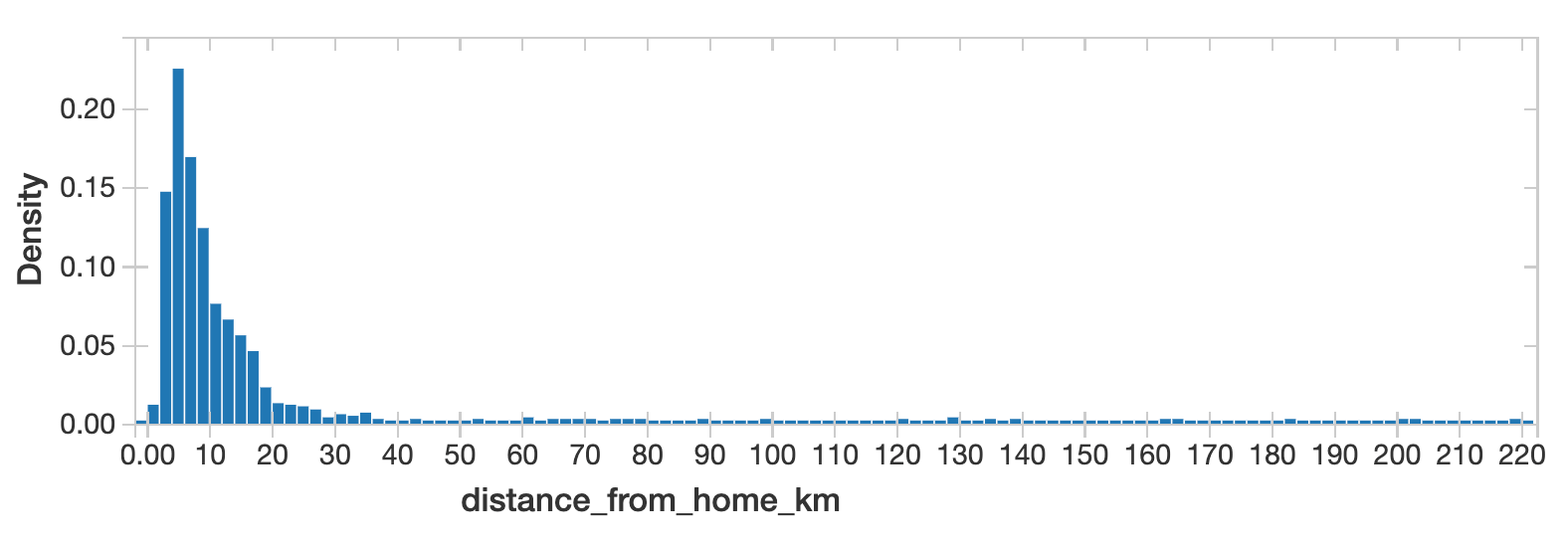
This data shows that most Starbucks locations draw visitors that live less than 10 kilometers away. However there is a long thin tail of Starbucks locations with the median distance from home is hundreds of km. These locations are likely in high-tourist or high-commute areas (like in an airport) where most visitors do not live geographically nearby.
What are the cross-shopping preferences of Starbucks customers?
The column related_same_month_brand and related_same_day_brand reports an index of how frequently visitors to a POI visit also visit other brands (relative to the average visitor rate to that brand).
Here we look at what other brands are frequently visited by customers of Starbucks. The larger the index, the more frequently starbucks customers visit that brand.
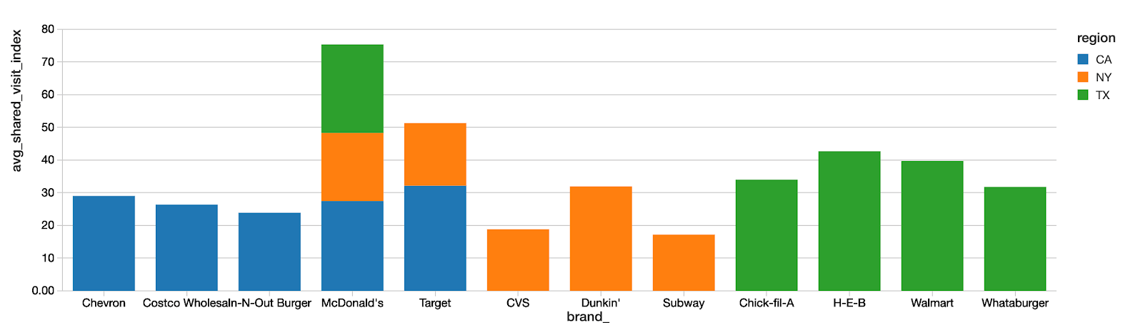
Although Starbucks is a national chain, cross-brand shopping is highly influenced by local geography. Here we show the top 5 top cross-shopping brands for Starbucks customers in California, New York, and Texas. Only McDonald's is in the Top 5 of all 3 states.
Analyzing a Brand’s Customer Demographics
You can use SafeGraph data from AWS Data Exchange in Databricks to analyze the customer demographics of individual POI or brands. For a deep dive on the methodology, along with more complete statistical analysis feel free to read this workbook.
Here we analyze Starbucks Customer Demographics along the Race Demographic dimension using available from SafeGraph in AWS Data Exchange.
This analysis could be repeated for any demographic information tracked by the Census, and reported at the census block group level. That includes Ethnicity, Educational Attainment, Household Income, and much, much more.
To do this analysis we will use:
- Census data (from Open Census Data)
- SafeGraph Patterns data, specifically the visitor_home_cbgs column
- SafeGraph Panel Overview data
The y-axis shows the % of total visitors for each demographic segment.
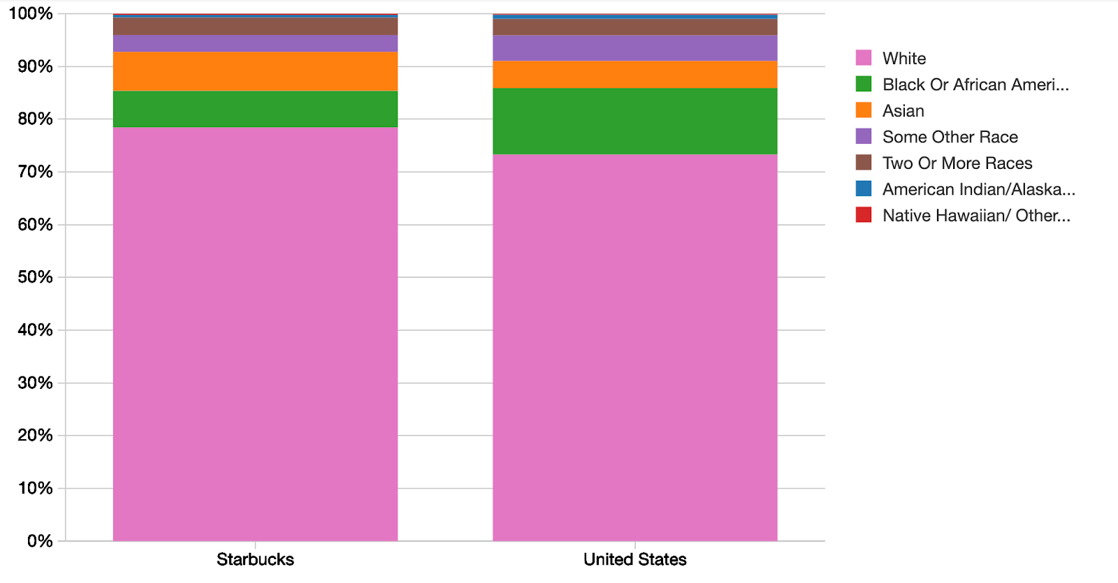
The baseline demographics of the United States are shown as a reference. SafeGraph Patterns shows interesting differences between the census area demographics of Starbucks Customers compared to the overall USA population
- SafeGraph Patterns data shows that on average, the home census block groups (CBGs) of Starbucks customers are 78.4% White, whereas the USA population is only 73.3% White. In other words, the home census areas of Starbucks customers are a larger fraction White than the US population.
- The home CBGs of Starbucks customers are a larger fraction Asian, compared to the USA population.
- The home CBGs of Starbucks customers are a smaller fraction Black or African American compared to the overall USA average.
Importantly, these differences are not due to geographic sampling bias in the SafeGraph dataset. It is true that the SafeGraph dataset has some small geographic biases. For a full report see "What about bias in the SafeGraph dataset?". However, we are able to measure and correct the small effects of sampling bias in the SafeGraph dataset as part of the cbg_adjust_factor calculation. If the differences observed were due solely to geographic sampling bias in the SafeGraph dataset, then they would disappear after the correction. The differences that remain cannot be attributed to sampling bias. For a thorough discussion on this methodology, see A Workbook to Analyze Demographic Profiles from SafeGraph Patterns Data.
Summary
- Reading SafeGraph data from AWS Data Exchange into Databricks is quick and easy.
- Combining these technologies and datasets enables you to answer powerful and precise questions about consumer behavior.
Thanks for reading!
Want to get more SafeGraph data?
- There are over 20 datasets available for free or for purchase in AWS Data Exchange. Check them out!
- And you can download CSVs for data on over 6MM points-of-interest at the SafeGraph Data Bar. Use coupon code SafeGraphAWSDatabricksNotebook for $200 of free data.
- Questions on this notebook? Drop us a line at [email protected]